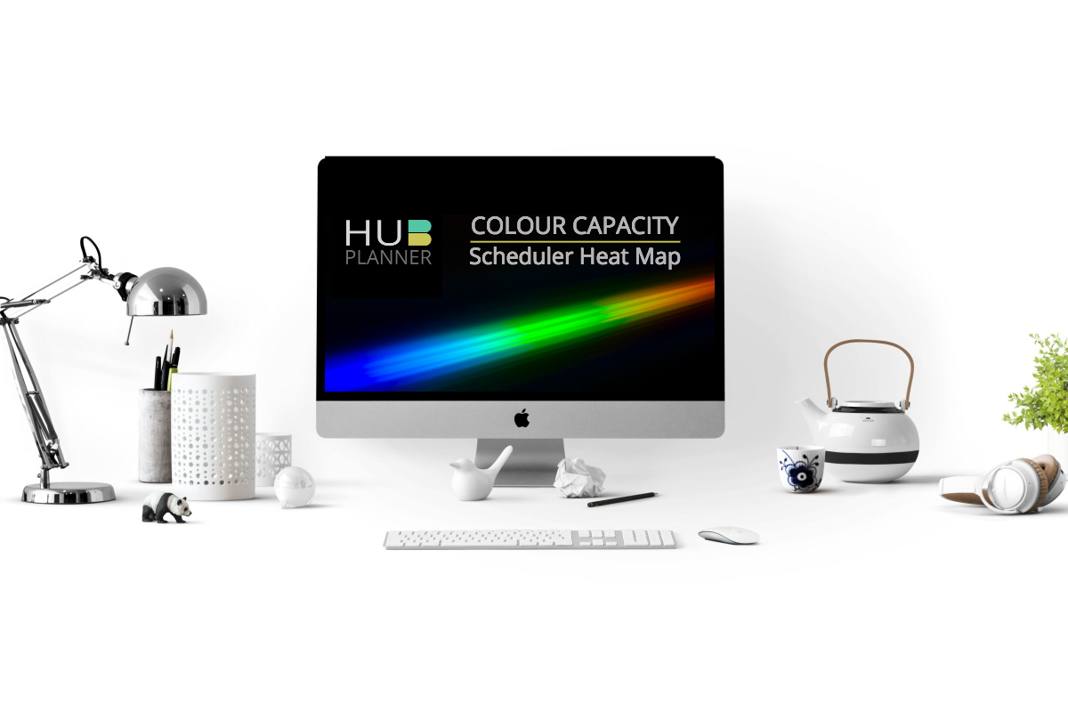
Improve Resource Planning with Hub Planner’s new Heat Map
Hub Planner have widened the spectrum of colours available and the scale in which they represent allowing for a more comprehensive “heat map” gradient customization view in your scheduler.
The idea and advantage of the “heat map” view in your scheduler allows you to visualize and identify resource availability where you can optimize and forecast the scheduling and planning of resources.
For a more in-depth thorough view of your resources, Hub Planner have enhanced the shades/gradients of colours in their bank allowing you to envisage a more complex and real time high level visualization of resource planning and scheduling. You can adapt and configure a simple primary colour theme or perhaps create a more visual cortex to represent a full range of the visual percepts available to you.
Display Capacity Bar

Another helpful option Hub Planner have added is a new Checkbox which allows you to control the width of the capacity bar. Especially useful for any resource under 100% capacity – the bar will only fill the width based on what percentage the resource is booked.

How to Configure
By following the below few simple steps, you will see in your Scheduler how the colours reflect the amount of time resources are scheduled at a birds eye view. Having those extra variables of colour shades really gives you a more efficient and optimized resource view.
- Go to the “Settings” tab on the top right hand side of the page
- Scroll down the sidebar to “Custom Settings” and click on “Customization”
- Go to “Booking Notification Bars”
- Next, here is where you can click on Display Dynamic width of Capacity Bar.
- To colour code the variables simply click on the first square: default colour will be set to white.
- From here you can choose your preferred colours that will represent the various availability percentage scales from the array of shades. Green representing the goal of 100% capacity. Blue representing 0% capacity / full availability.
- At the bottom of the page, click “Save Changes”.
- Next, go back to your Scheduler and pick a view type from the 3 available options.


Key Benefits of a Resource Heat Map
There are many key benefits to using colours to represent different levels of availability or over capacity. The enhanced colour spectrum allows you to tap into key percentages that are important to your business. Hub Planner sells transparency within your schedule, and the colour coding visually enhances that to allow for a quick glance of how the resources are planned.
* Optimize efficient planning and scheduling of resources
* Quickly identify resources over or under utilized
* Toggle views for pure heat map view or just capacity bar.
The end result should be that you can identify problems in your planning or if someone needs more work, or someone is over loaded.