
How to capture a Resource Availability Report?
This report will be able to show you the available time of resources during a set period of time.
In this report you can use the filters and functions to define settings:
- Filter to report on specific Resource Groups or individual resources you want to see the availability of.
- Set the date range.
- Create a date availability report which will show you a breakdown per set frequency (Day, Week, Month or Year)
- Option to add some extra data columns for more in-depth knowledge.
- Utilize the Conditional Formatting to highlight data.
Step 1. Navigate to Reports in Hub Planner
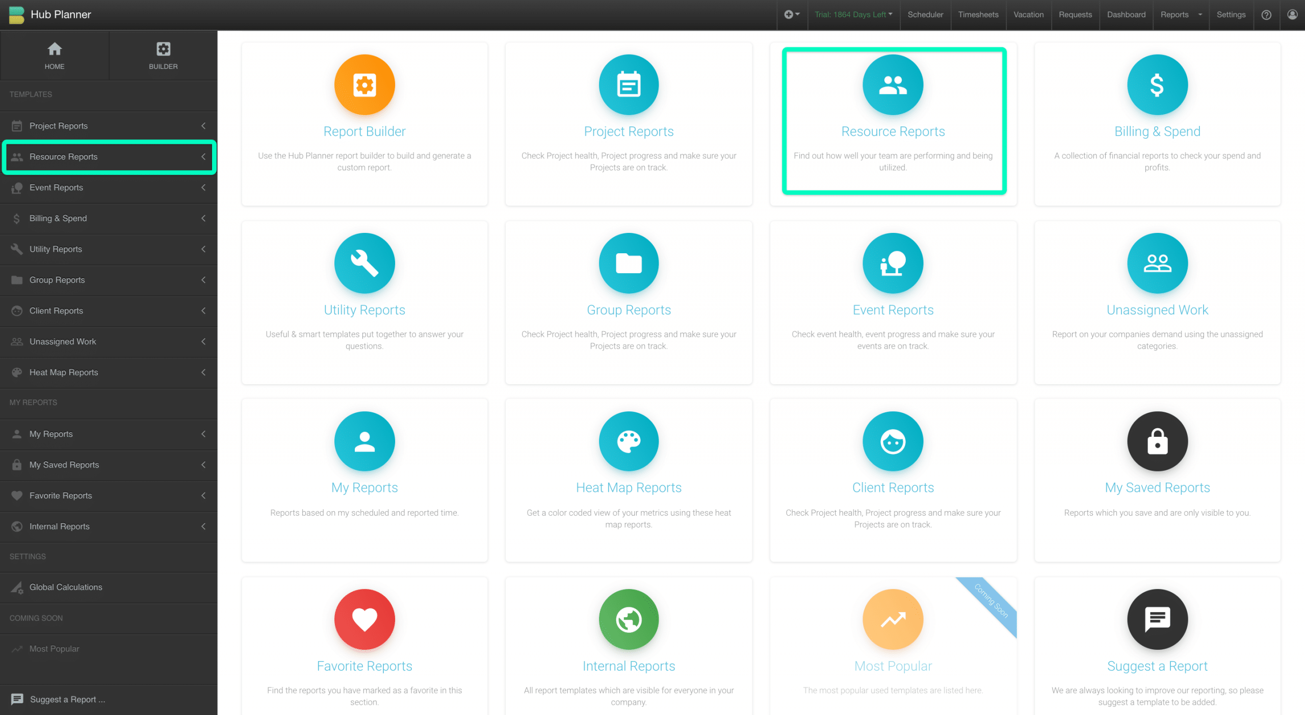
To create a resource availability report, you need to follow these few steps. Select Reports from the top line horizontal menu. This will open the Hub Planner Reports. Showcasing Report Folders and corresponding sidebar.
Firstly, we need to access the Resource Reports
- Navigate to Reports
- Select the Resource Reports folder or the Resource Reports from the sidebar.
Step 2 – Resource Availability Report Template
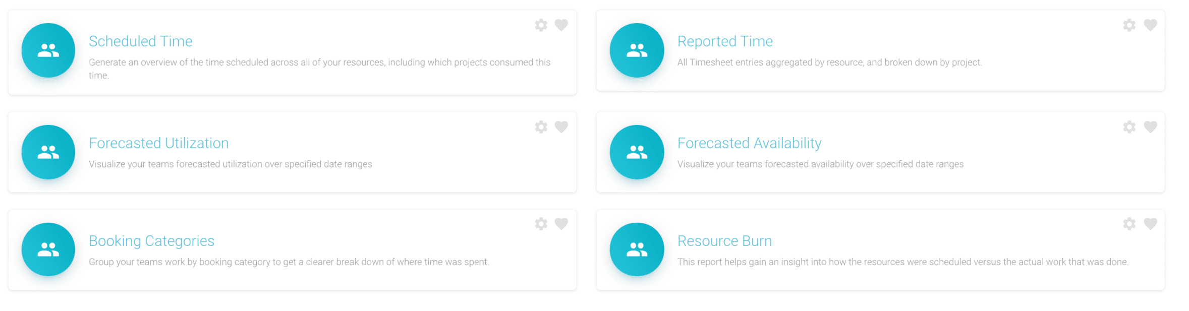
In this report we will be choosing the Resource Reports folder or sidebar option. There are a set number of pre defined templates within each folder. For this report we will look to use the Resource Forecasted Availability template. We will show you how to set and adjust to your requirements.
There are 6 resource report pre-formatted templates available. We will look to choose Forecasted Availability.
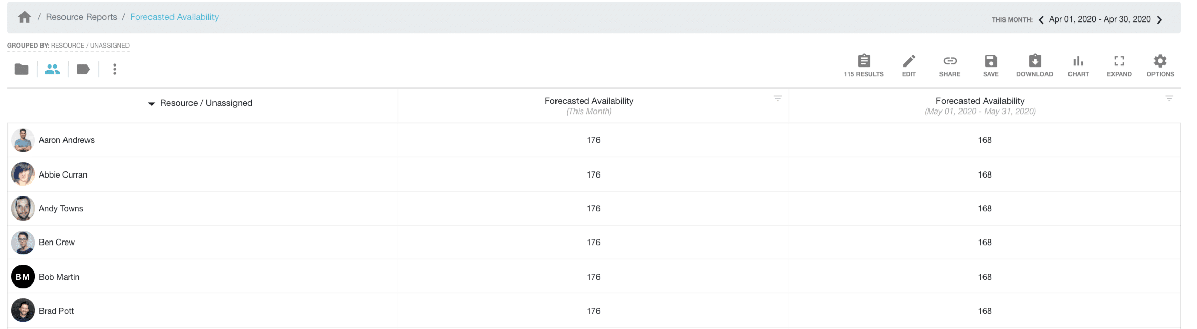
Once you click the template. Your report will appear with the following data:
- Resource Name
- Forecasted Availability This Month
- Forecasted Availability Next Month
Next, we need to learn how to filter, edit and adjust the report.
Step 3 – Edit, filter and adjust Resources Available Report
Open the report builder to access options to edit and filter the report. Report Toolbar -> Edit -> Report Toolbar. There are 5 tabs to allow us to edit our report.
- Data
- Date Range
- Filters
- Columns
- Grouping
Data
Here we can alter which resources we want to show in the report. By default the report will be set to All Active Resources’. Opt to narrow your search down by Resource Group or particular resources.
There are 3 columns: Resource Groups, Single Resources and Selected Data. Selected Data is what the report will show. To remove the content from the Selected Data column, click the X Remove. Within columns Resource Groups and Single Resources, click to Add. You can scroll through the columns, alternatively type the resource via the search box. Once you are happy, click onto the next tab.
Date Range
Choose to switch the dates as necessary. By default, the report will be set to the current month. Click the arrow to choose from the pre-formatted options on the drop down list. Alternatively, click the calendar to customize a date range. We will then move onto the next tab, Filters.

Filters
There are 3 types of filters.
- Project Filters
- Resource Filters
- Other Filters
Within each filter type is a number of filter options. Depending on the report type, the filter options will vary.
When you click on the filter options in the left hand column. The corresponding options to filter appear. Note, some filter options are in tab format. For example: Project & Events and Resources & Unassigned. By default there are a number of filter options set by default. Click and choose the filter options to change. For example, you might opt to filter resources who are remote which you might have set in Custom Fields. Or filter by client for example. Some filter options include:
- Resource Custom Fields
- Clients
- Booking Category
- Project Status
Columns
 Columns allows us to pick the data that will appear in the report. So, right now, we have three columns.
- Resource Name
- Forecasted Availability This Month
- Forecasted Availability Next Month
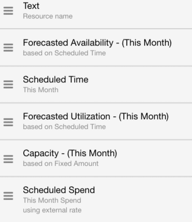
We can opt to keep/remove or add more columns into the report. The columns available appears on the left hand column (Available Columns) and the data columns set to appear in the report on the right hand column (Selected Columns). In this example, we will look to add some more data columns. Also, we will remove the Forecasted Availability Next Month column.
- Forecasted Utilization (Tells us the percentage rate of how utilized resources are during the date range)
- Scheduled Time (Hours the resource is scheduled to work)
- Resource Capacity (The maximum hours a resource can work)
- Resource Scheduled Spend (The scheduled spend per resource) (Note the Billing Rates extension is required to be installed)
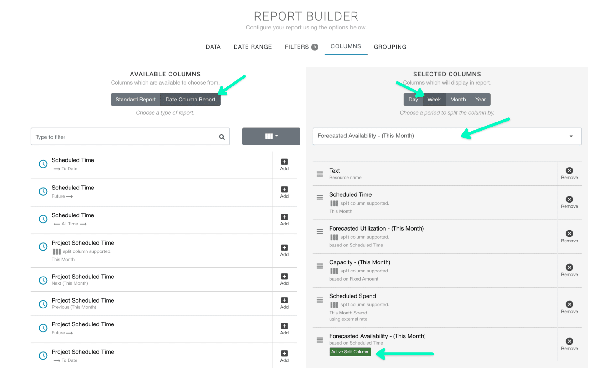
Date Column Report
Within the Columns Tab is the ability to set a date column report. This means we can create a heat map style report depending on the frequency we have set. To do so, we need to select ‘Date Column Report’ under Available Columns. Within Selected Columns. We need to select the frequency (Day, Week, Month, Year). And subsequently from the columns we have selected. Which one will we allocate to the date column breakdown. Click the column option from the drop down menu. The column applied will be highlighted by a green ‘Active Split Column’. Lastly, a good idea will be to move the active split column to the bottom of the report. This way the other data is visible at the start of the report.
Grouping
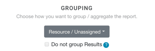 The last tab is Grouping. How we want to see the report data.
Right now, the report is set to group by Resource. Which means that it will show the filters and columns by the resource name. Alternatively you can switch how the report is grouped by clicking one of the options from the drop down list. We can check the box if we do not want to have the report aggregated or grouped. This will provide us with a raw level breakdown of data row by row. For this example, we are going to stick with what we have.
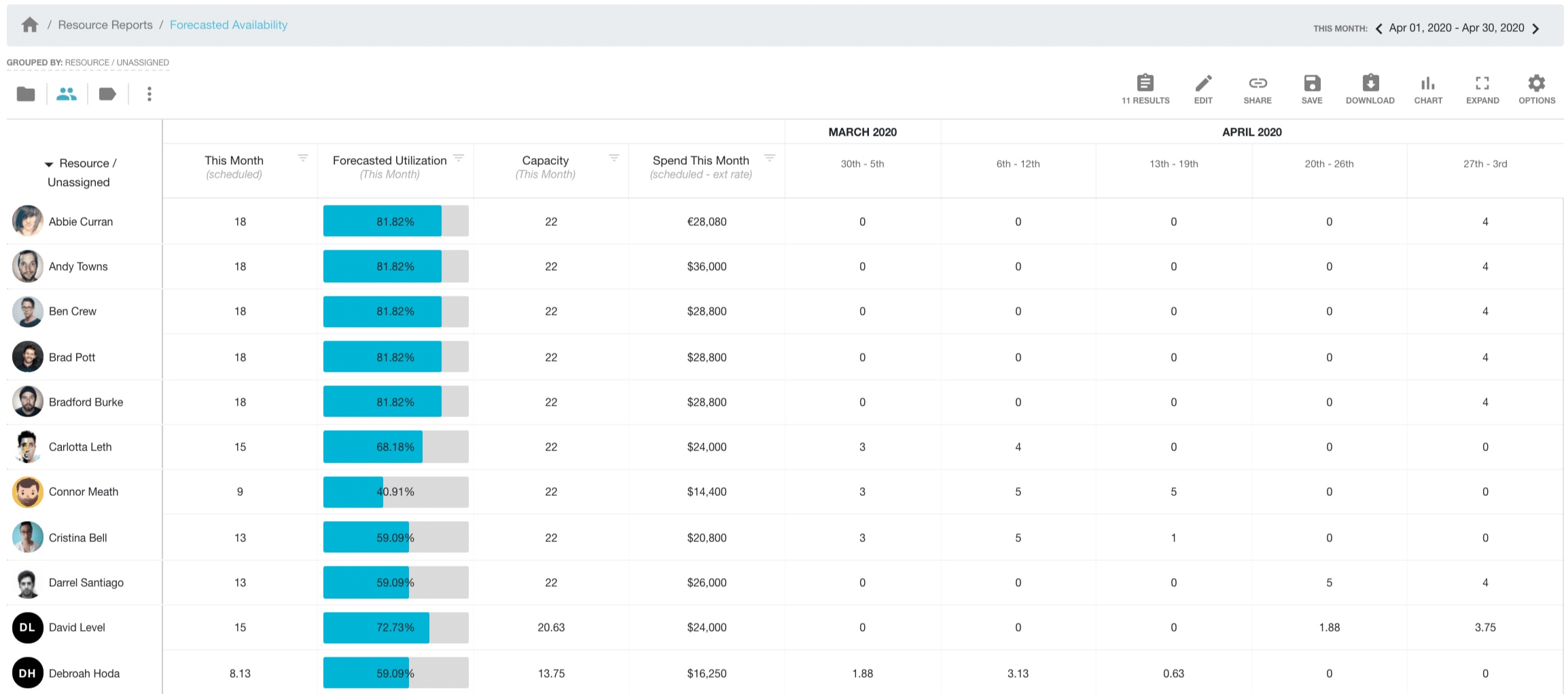
OK, so lastly, we click Update Report. Below is what you should see.
Step 4 – Optional Further Edits to Resource Available Report
There are some last options that can help us:
Date. Change the date range if required. Switch between last month and next month based on the filters we have provided. Just click the arrows to the left and right of the date.
Results. Opt to remove resources without any data showing. Click Results in the Report Toolbar. Select the option ”Exclude Results with No Data for this Date Range’.
Share. Click to share the URL of the report with colleagues or customers.
Save. It’s a great idea to save the report for future use. Easily access the report next month or to compare results from last month etc. You have two options to save. Private or Internal. Private will save to ‘My Saved Reports folder. Where as Internal, will save to the Internal Reports folder. Those that have access to this folder will have access to this report. It’s also a good idea to title the report so that it’s identifiable to you next time.
Download. Feel free to download the report via Excel.
Chart. Helpful charts allow you to view the data in a more visual way. There are separate toolbar specific for charts that allow you to switch views, change the axis data etc.
Expand. Full screen view of the report.
Options. Here you have a list of further options in how to view your report.
Change Units. More than likely your data is set to ‘hours’. You can opt to change this to days if you wish. To do so: Click Options -> Units. Select Days and refresh the page.
Conditional Formatting. Hub Planner provides you with the option to apply conditional formatting to your report. Use this to highlight data in your report. For example, you can highlight resources that are under scheduled in the color blue. Highlight resources over scheduled in red. This will allow you easily identify important data and make decisions quickly. To do so, click Options -> Conditional Formatting. The pop up will appear where you can apply multiple rules to help identify data.
Aggregate. This will depend on the report. You can opt to aggregate or not. This way, you can see a condensed or in-depth view of data
Theme. Switch between light and dark mode.
Help. Direct link to the Report Knowledge Base.