The story of Hub Planner started over a decade ago, there’s been an evolution since then in terms of functionality that has made it into the feature rich resource management platform it is today.
A core focus on solving our customers pain points has pushed our roadmap with expanding functionality from handling simple to complex scenarios. As the Hub Planner feature set grows it becomes even more important that the tool is designed for the user’s workflows where the most important functions are easily accessible, and do not become too difficult to use.
To address this, with our users feedback in mind, our design team has started working on a design refresh that will be the new foundation for our platform going forward. The updates will be slowly visible over the next few months, but it isn’t a complete overhaul. Instead, we’ve focused on making Hub Planner not just look better, but work better for the users, all while preserving the platform’s core logic and functionality. You can already start seeing a gradual roll-out in some menus and modals. More on that below.
A first look at the new design
The new design will bring consistency and cohesiveness across the product, leading to a better user experience through familiar and intuitive design patterns.
As mentioned, you can already see glimpses of this new design in some menus and modals, as well as in recently rolled-out features like multi-select and extended repeat, offering a preview of what’s to come.
Crafted for clarity

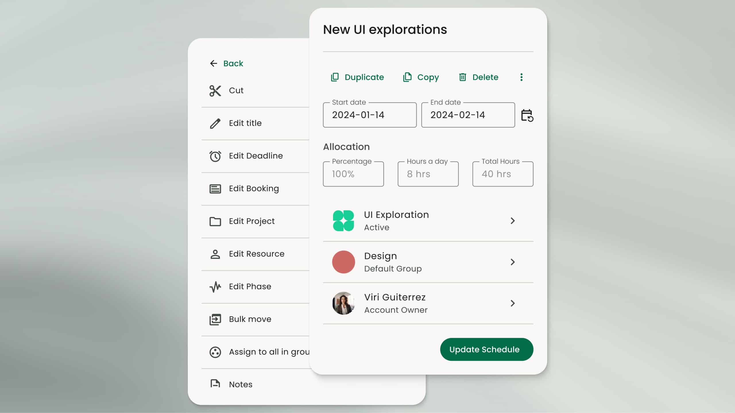
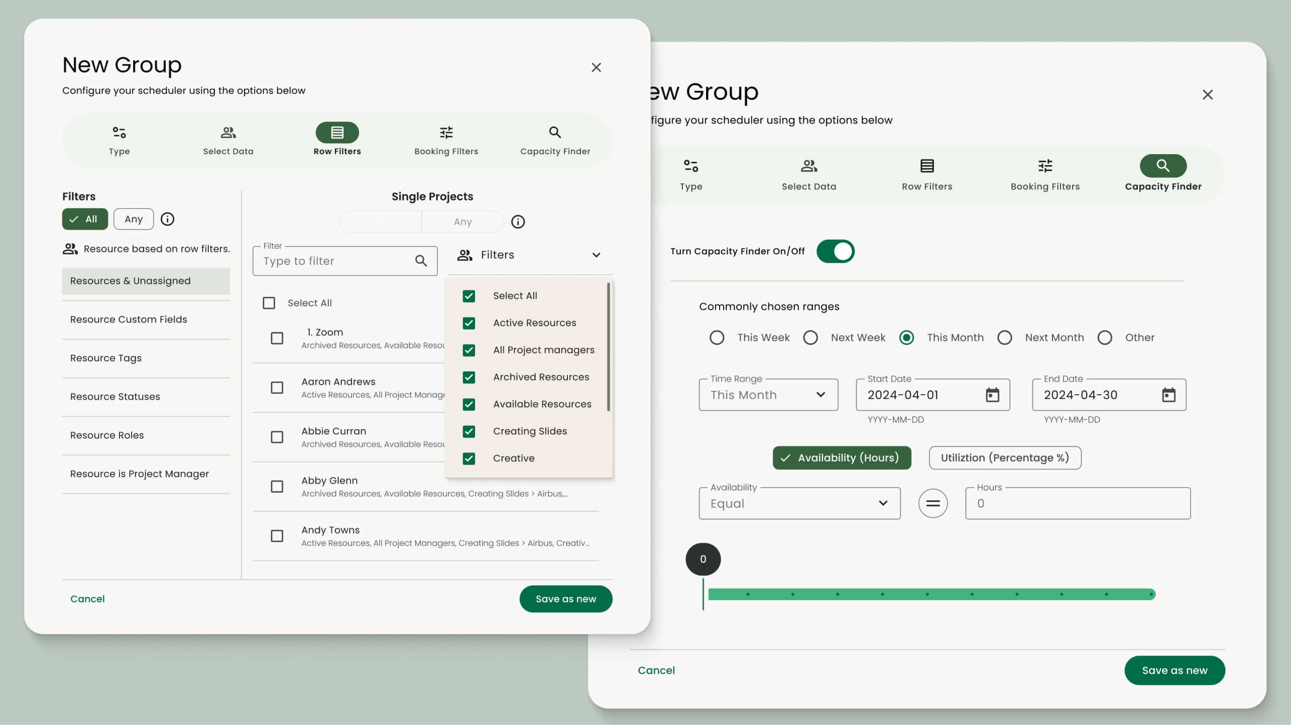
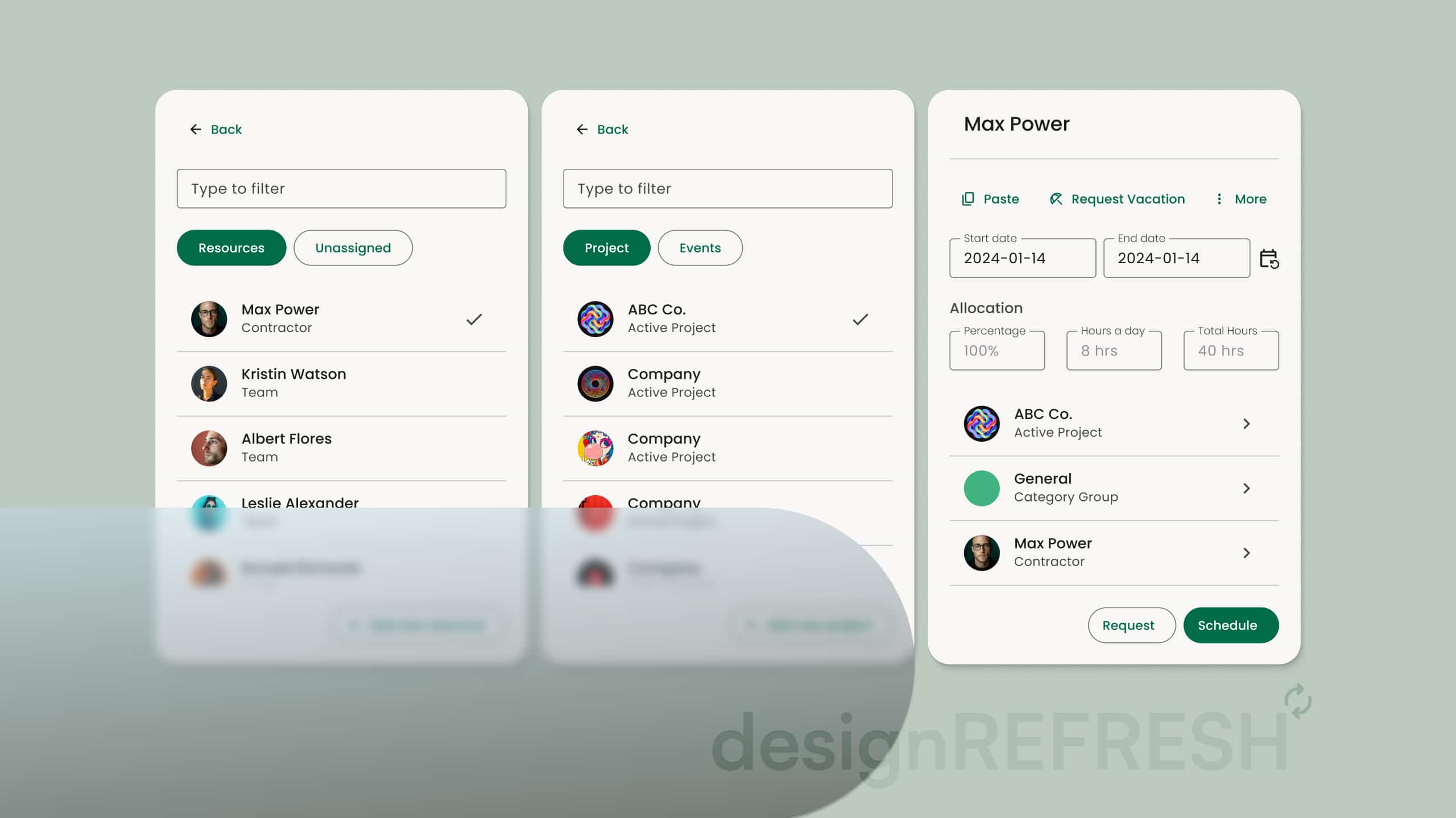
These modals have been the first to undergo a redesign, with a strong focus on enhancing your workflow by making key features more accessible and prominent

The updated modals also feature a sleeker design, improving navigation and making your workflow more intuitive and seamless.
Fine tuning, step by step
Shipping the first parts of the design refresh is a great milestone, but it’s very much more like a beginning than an end. We’ve laid a new foundation, but design is an ongoing process, not an event. We have plenty of updates in the works that will roll out gradually, each one improving the user experience, making it easier to fully utilize the power of Hub Planner.
“This is just the beginning and we’re already excited about the next new things we’re working on and the evolution of Hub Planner. We’ll continue to commit our time to making Hub Planner not just look good, but work better for you. We think you’ll love the result – a tool that’s more intuitive, more efficient, and ultimately more enjoyable to use.”
Explore more of Hub Planner
All the features you need to manage your resources and drive successful projects.
Resource Management
Streamline team scheduling and gain instant visibility into availability and utilization for efficient planning.
Timesheets
Measure the actual time reported via timesheets versus the forecasted time through the resource scheduler.
Dashboards and reports
Grasp performance, project costs, profitability, and team utilization in a comprehensive overview.
Project management
Manage project spend, change resource rates, internal costs, profitability, and project budgets.


