Introducing our New Resource Planner for 2015
As promised we are starting Resource Planning for 2015 with a bang at Hub Planner! We have just released a brand New Resource Planner for 2015, re-written from the ground up and packed full of new features to make your resource planning all the more effective.
There are lots of small tweaks made to the system, but the main updates include:
- Fluid Scrolling
- Capacity Bar
- Availability Mode
- Inline Filters
- Fresh Design Update
- Performance Upgrade
- Zoom Capability
- Usability UX
- Customisation
Fluid Scrolling
In the new grid you now have the ability to scroll horizontally as well as vertically using your mouse wheel or track pad. This allows you to freely move around the grid and not have to paginate each grid view. Once you reach the end of your scroll you also have the option to add new data by clicking on the ‘Load More’ bar that appears to the right or the left of the grid.
Capacity Bar
We are introducing a brand new capacity bar which if enabled will display the different states of a booking. The following bars can be displayed:
- Overbooked Bar
- At Capacity Bar
- Under Capacity Bar
- Available Bar
- Not Available Bar
You have the options to change colors and toggle visibility of each of the individual bars in the settings page under ‘Customisation’.
Availability Mode
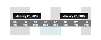
If you prefer to always see the availability of your resources when you plan, you can now turn on availability mode which always displays the availability of your resources so you can easily see their capacity as you book them. This availability mode is also available in conjunction with the Capacity Bar, but works on hover of each cell.
Inline Filters
There is a brand new filter in the bookings grid header which allows you to quickly filter out resources in the grid. The filter smartly detects the resources in the grid and also predicts the text as you type. You can filter multiple resources at once.
Fresh Design Update
We have given the user interface a bit of a face lift and made the action buttons a little more minimal and flat. We have also reworked the main tools section giving you an easier way to add bookings to the grid.
Performance Upgrade
The new bookings grid has been rebuilt from the ground up giving you a much more performant speed when navigating your bookings. This is most notable on larger client accounts with big sets of data.
Zoom Capability
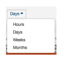
The older version of our bookings grid only allowed you to view days and hours. We have now updated this to allow you to view and book time in hours, days, weeks and even months at a time.
Usability UX
In addition to freshening up the design we have also improved the usability in some key areas. A new hover menu was added to the resource name in the grid, giving you direct access to that particular resource. We have also cleaned up the main menus removing unnecessary fly out menus and adopting an accordion style approach for easy project selection. We have also introduced tooltips over the bookings so when you drag a booking or highlight a selection, you can clearly see the dates.
Customisation
All of the new capacity bars and availability settings are fully customizable under settings.You have the choice to switch colors of every bar to make it match your own colour schema or choose not to show them at all.
How do we upgrade to the new grid?
The new grid upgrade is 100% free for everyone. We have automatically upgraded your account to the new grid so existing user or new user, you can start digging in right away. If you have any feedback, please us the support option in the header to reach out to our support team and let them know what you think!
Updates
We are tweaking the new grid all week. All fixes, patches and updates can be followed here https://hubplanner.com/new-bookings-grid-tweaking

