Active Resources Dashboard or Resource Group Dashboard
Here we will look at how the Dashboard works when it comes to viewing a Resource Group like Active Resources or Design Team, for example.
Use the sidebar to select the Resource Group you want to view. In this case, we will use Active Resources. Your role rights and permissions will determine what you will see in your sidebar. Also, you will need Dashboard Pro to view a Resource Group Dashboard.
- Within the sidebar, click the Resource Tab
- Select the first option Group Dashboards where a list of resource groups will appear.
- Choose the resource group dashboard you want to view.
- The Dashboard will automatically update with the data.
There are 3 inline tabs within a project group dashboard:
- Dashboard
- Utilization
- Projects
Each tab compiling the data for the resource group within the date range selected. You can alter the date range from the pre populated options located at the top right of the page. Alternatively, opt for a custom date range either.
Active Resource Group Dashboard
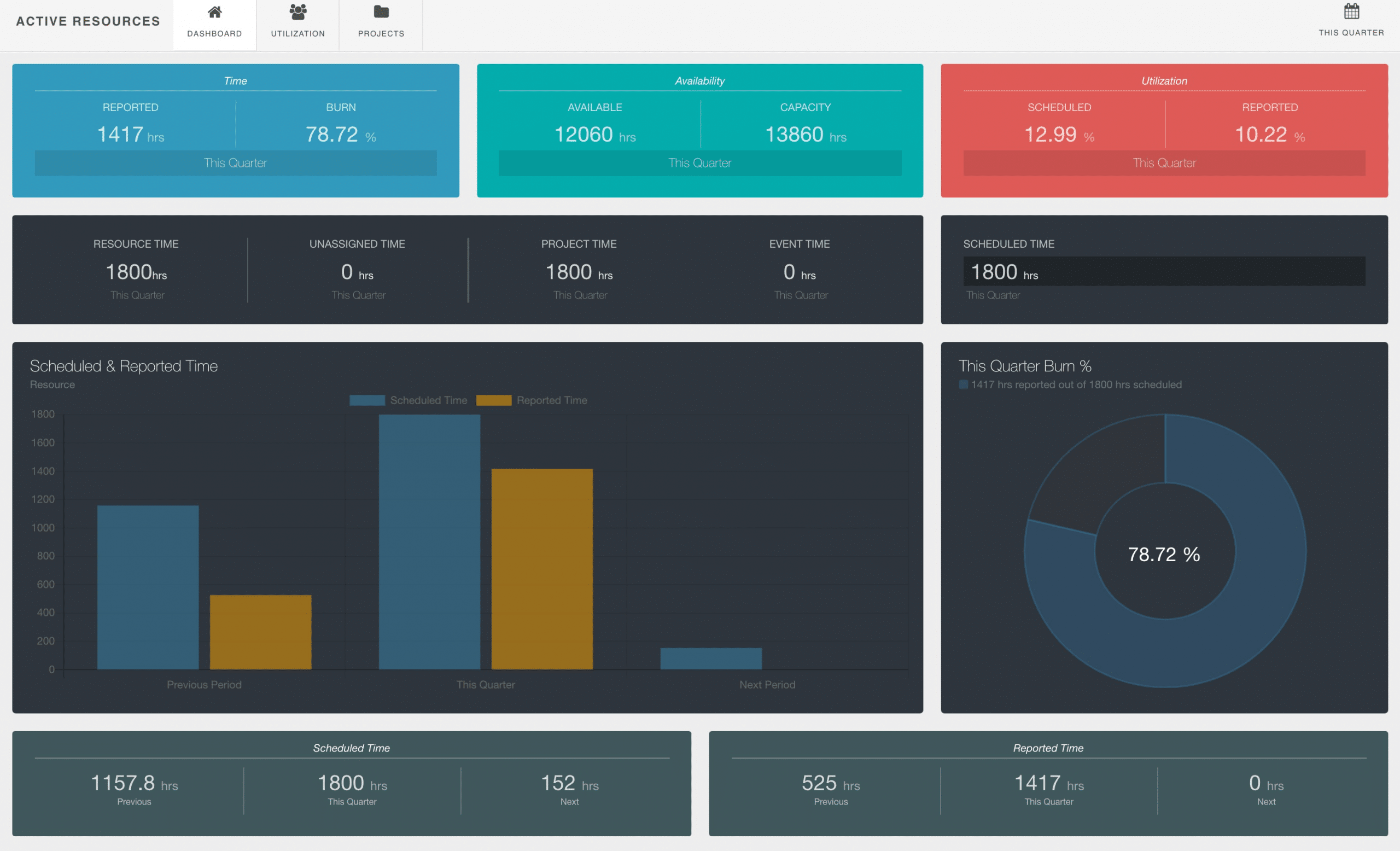
What will we see? Once you have the rights to view the content on the resource group dashboard. You will see the overall picture of your resource group. The dashboard will detail stats in their representative widgets and silos. As you see in the image below, you have sight of:
Time.
Which shows reported time as well as the burn or progress rate for the date range selected.
Availability.
Shows a total of hours available of all resources within the resource group for the date range. As well as the capacity of all resources within the resource group.
Utilization.
This pods details the high level stats of overall resource utilization rate for the resource group. The pod shows two rates. Scheduled utilization rate and reported utilization rate over the date range.
Time.
The next pods shows time in a number of different representations:
- Resource Time
- Unassigned Time
- Project Time
- Event Time
Scheduled Time.
Overall Scheduled Time is represented in a pod of it’s own.
Scheduled & Reported Time Chart.
This is a really helpful chart displaying the bar chart of scheduled (blue) and reported (yellow) time. Not only that, you have sight of viewing the current data against the previous and next period too.
Burn %.
The burn rate is a percentage based representative of reported time against scheduled time. Are they on par or are you over, under etc. Based on the date range, you will also see the data that represents this figure too. At the top of the widget, you will see the number of hours reported and the number of scheduled hours too which is great for reference.
Scheduled Time Periods.
In the bottom left hand pod, the scheduled time is showing the total amount of hours for the previous, current and next date range you have selected. In this case, the date range is ‘This Quarter’. So the data in the example below represents Last Quarter, This Quarter and Next Quarter. So you have a good insight into how much time has been scheduled over the 3 periods.
Reported Time Periods.
Then lastly you have the reported time over the 3 different date ranges. Again, Last Quarter, This Quarter and Next Quarter. The widget shows the total count of reported hours within the 3 time periods.
Active Resource Group Utilization Rates
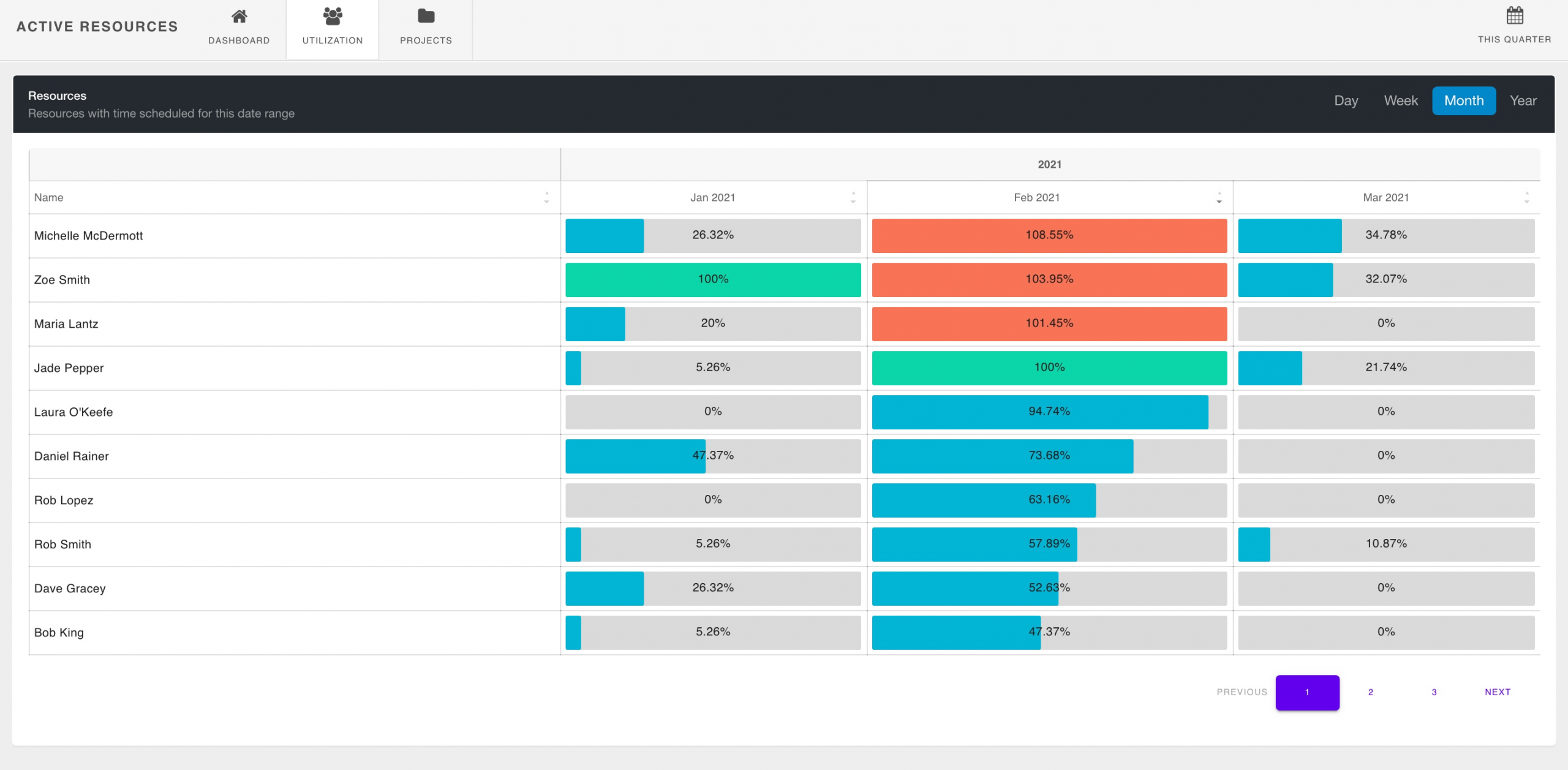
Click the Utilization tab to view the utilization rate of the resources working on the resource group selected. The utilization rate quantifies the users capacity / scheduled time. How much are resources being optimize? You might recognise this style from the forecasted utilization report. Indeed, it’s the exact same. The dashboard utilzation is showing you the scheduled utilization rates of resources scheduled within the resource group selected.
The dashboard will show the first 10 resources, click through the pages to view more resource utilization data. You can also opt to sort the columns too.
Pick through the frequency options too. View by day, week, month or year. Switch through the date ranges too.
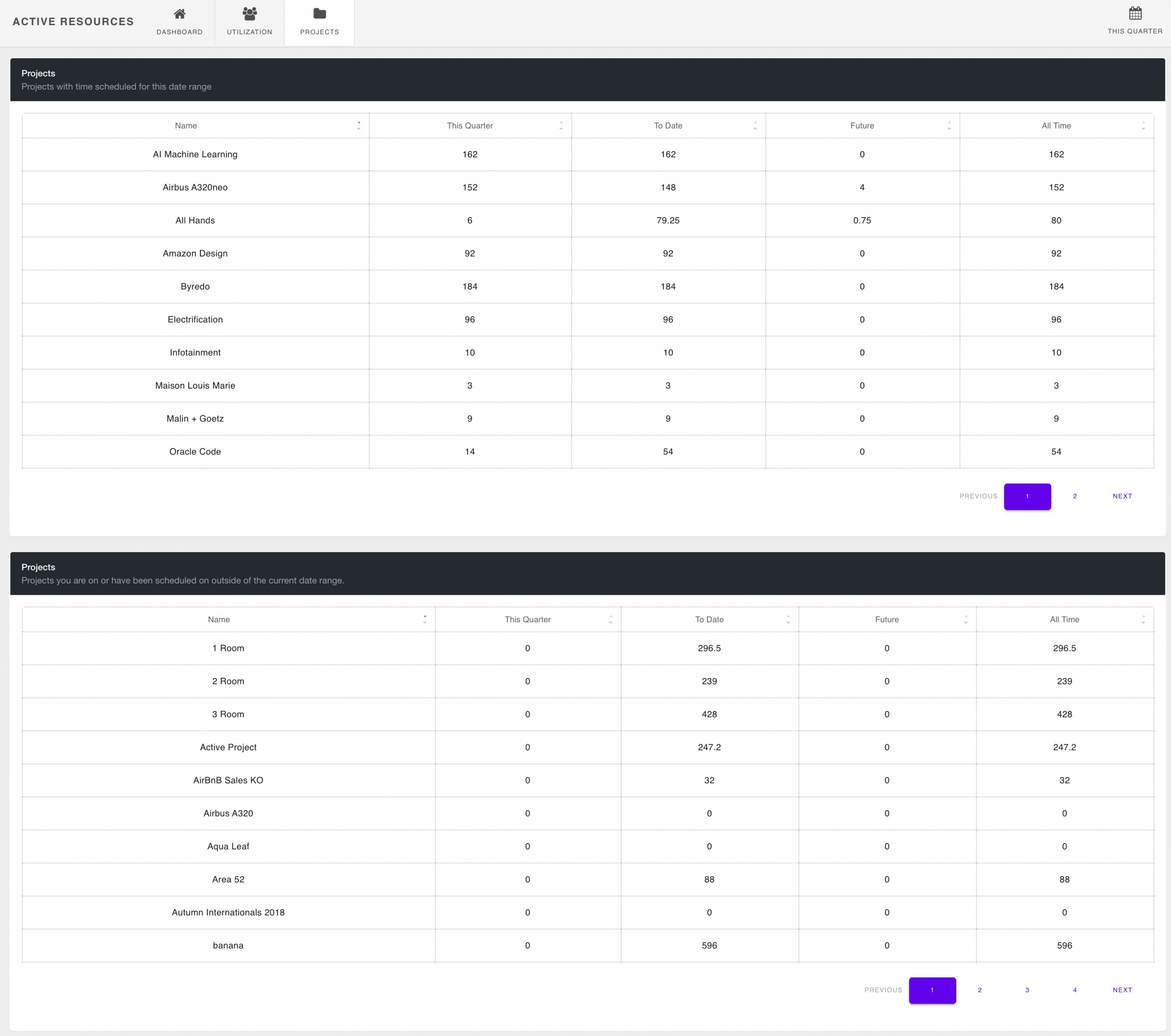
Active Resource Group Projects
Separated into two sections. The first pod you will see scheduled hours for projects within the date range selected. The second pod, shows projects from the resource group without any time scheduled against projects from the project group within the date range.
Each pod will display the following:
- Project Name
- Date Range selected hours scheduled
- To Date scheduled hours
- Future scheduled hours
- All Time scheduled hours
Each pod will display the first 10 projects. Click through for the next 10 projects and so on.