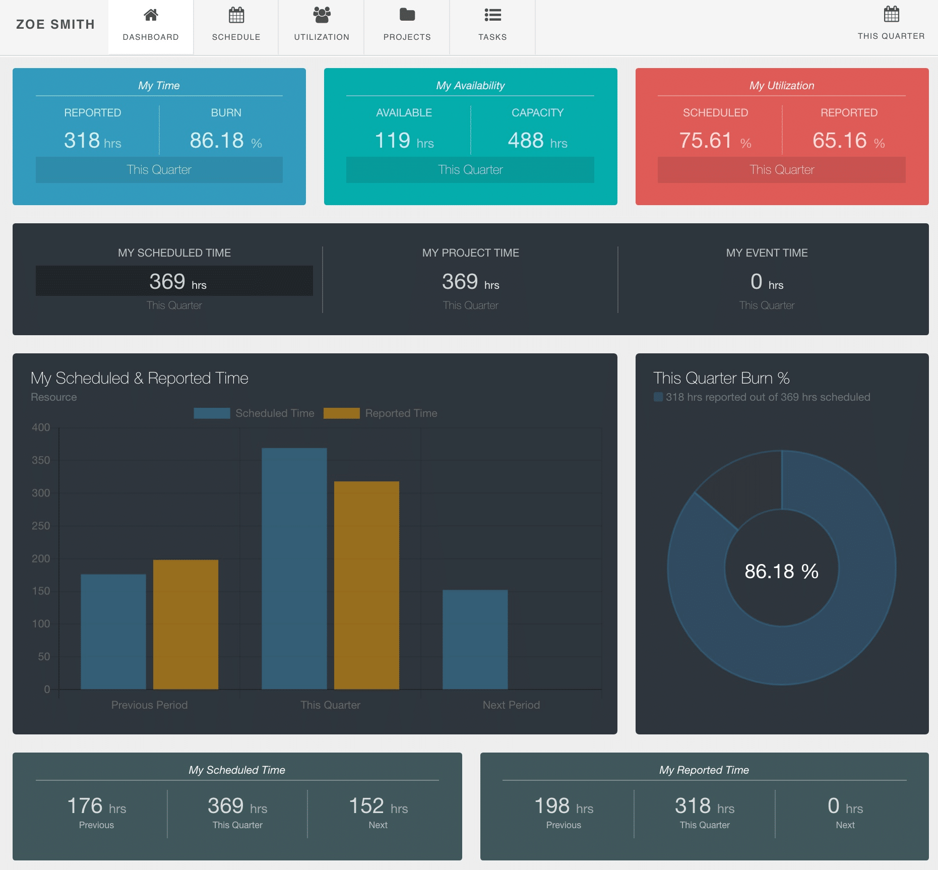
My Dashboard in Hub Planner
What each resource will see within their own My Dashboard in Hub Planner entitled ‘My Dashboard’. Every user will have access to view the main stats and times broken into different representative widgets, pods and graphs.
There are also 4 further inline tabs available for the resource to see their schedule timeline, the utilization rates, projects they are working on and the tasks assigned to them.
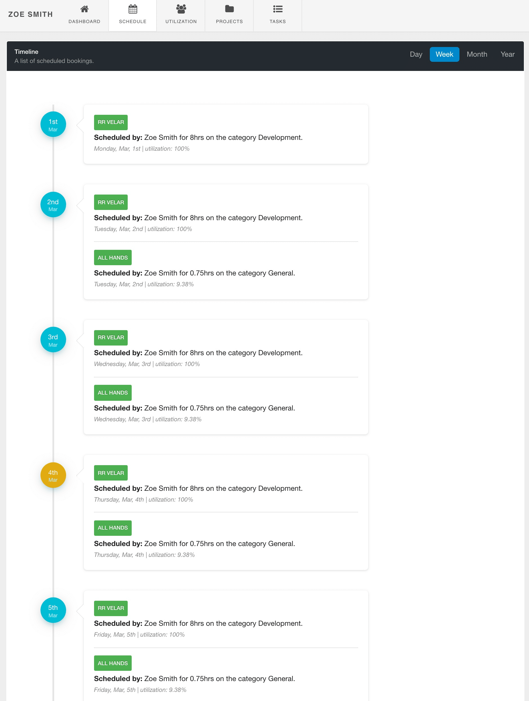
My Dashboard: Schedule Timeline
The ‘My Schedule’ is a new tab and replaces the old calendar view of the scheduler within the old My Dashboard in Hub Planner. My Schedule will detail the users bookings on projects and events in a timeline style. Similar to what you will see in the recent Slack integration. The timeline view gives users a detailed view of their perspective work ahead. Function options include viewing the schedule in different frequencies. Options include Day, Week, Month and Year.
Each booking will detail the project name, whom created the booking, the allocation time and the booking category assigned. The current day, will defaulted to yellowish color to help the user navigate and distinguish today’s date.
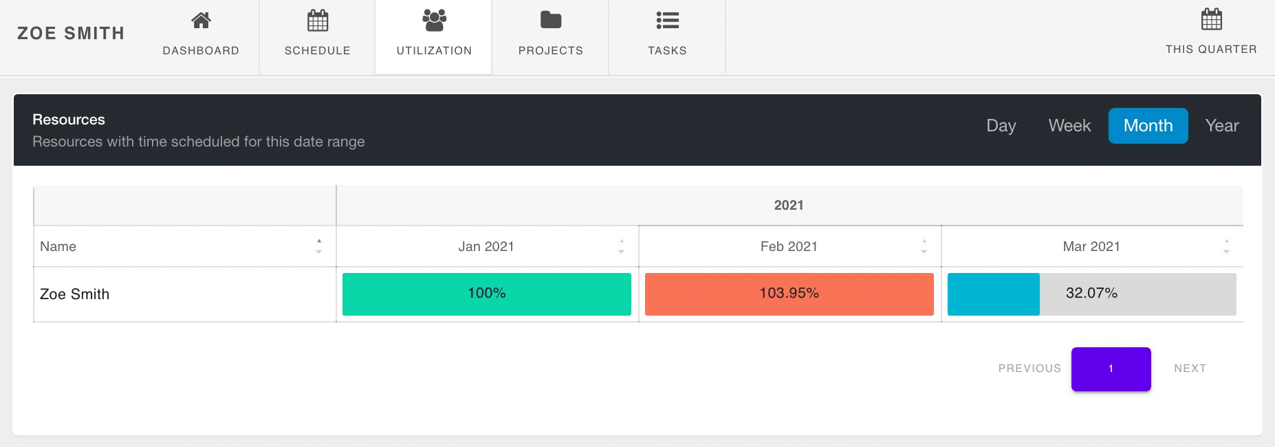
My Dashboard: Utilization
The next tab within my dashboard in Hub Planner is Utilization. Utilization measures the amount of capacity the resource has been scheduled. For example, if I work a 40 hour week, and I’m scheduled on 40hrs of project work, that’s me 100% utilized. Like in the example image below, for January the resource is 100% utilized. Should a resource be scheduled more than their capacity, then they are over scheduled and indeed over utilized. This is flagged by the color red and shows here in the dashboard, the scheduler and in reports too. Lastly, if the resource is underscheduled, not to capacity, has available hours left in the day, the week, the month etc. Resources whom are under utilized are highlighted in blue like you see in the below image (March).
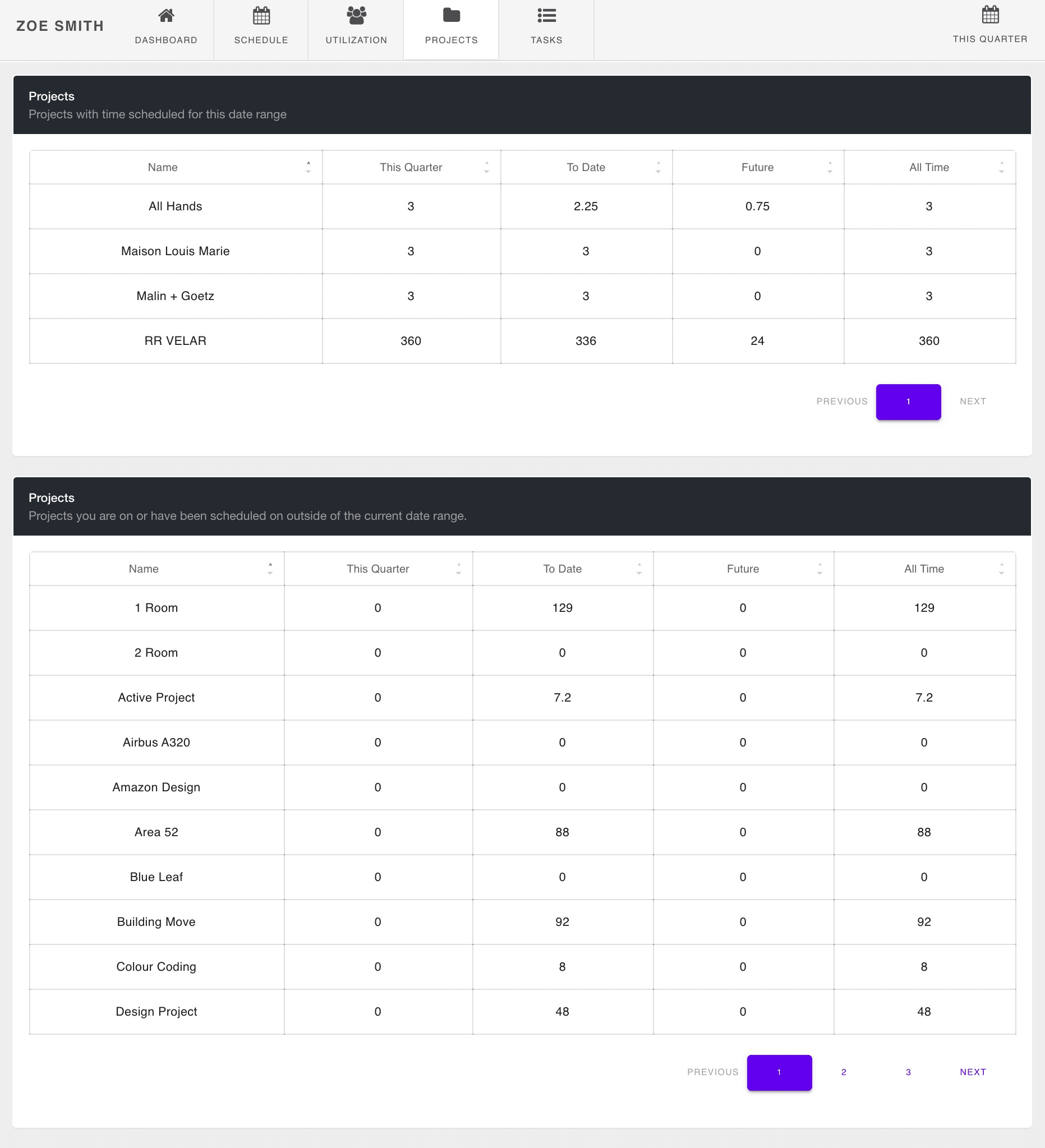
My Dashboard: Projects
The next tab in my dashboard in Hub Planner will show the projects that the resources is working on. The below image shows the projects the resource is scheduled on in a table or report format.
The project name will appear in the first column. Subsequently, time is split into different date columns, options include the date range chosen, time to date, time scheduled int he future and finishing with all scheduled time for the project. The date range (first column) can be altered by choosing an option from the date range picker in the top right of the page. Note, these times are scheduled and not reported time. For access to view reported time, navigate to reports to access a template or build a report. Should the resource be assigned to more than 10 projects, the subsequent project details will follow on the next page.
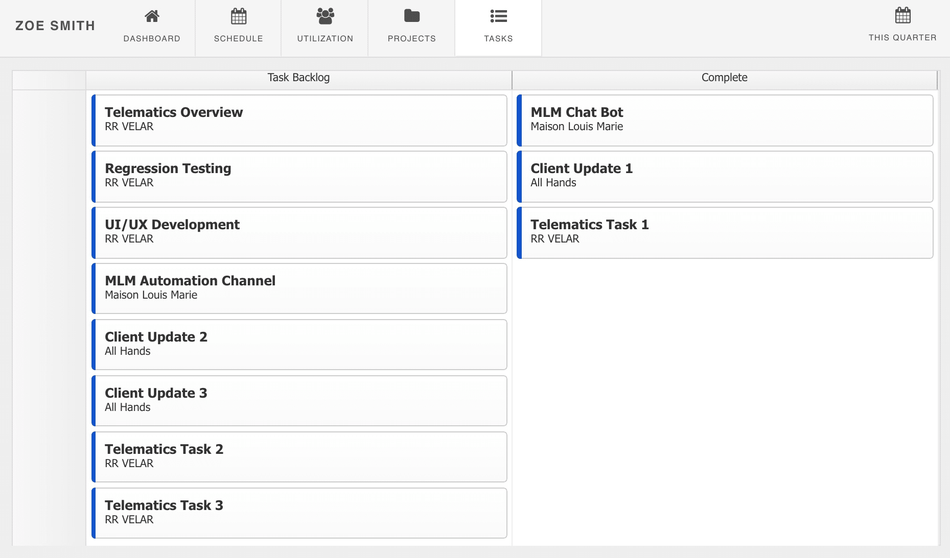
My Dashboard: Tasks
Lastly in My Dashboard in Hub Planner are the Tasks. Tasks that are assigned to you as a resource. Here you can view all project tasks in the one spot. Feel free to drag and drop tasks between Backlog and Complete.
Related Articles to My Dashboard in Hub Planner
How to Plan & Forecast the Project Pipeline Demand using the Unassigned Work Feature