We are very pleased to announce the first release of our brand new Hub Planner Reports Section. The new reports section can be accessed from your header once you login to your account. With Reports we created an informative page giving you relevant and important statistical data on the bookings you have made for your business.
Reports gives you a very nice overview during planning meetings or when looking back over projects to see how much time was spent, and by which resources on which projects. Some of the key features include:
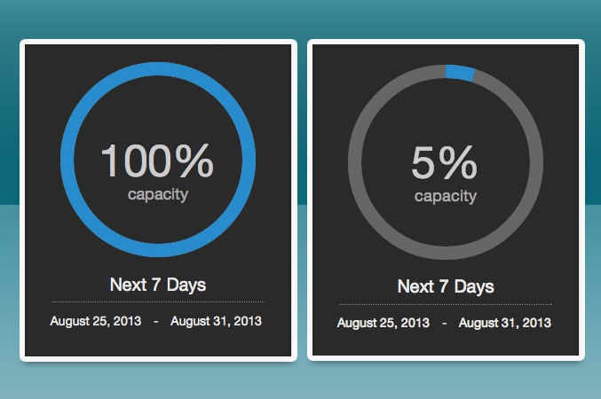
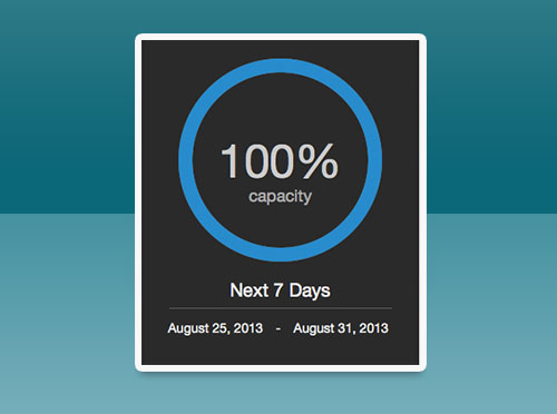
Capacity
Using a nice pie chart we give you a graphical representation of what your resource and or project capacity is looking like. So for example if you are fully booked, this chart will say you are at 100% capacity, otherwise it will tell you how much capacity you have to take on new projects.
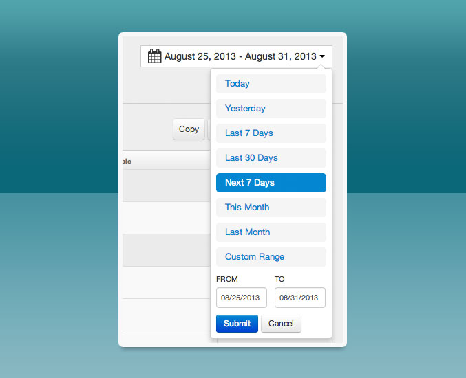
Smart Range Choice
Similar to other popular analytical software such as Google Analytics our Reports section lets you choose from smart date range filters to quickly access your last or next month / week. Once you choose a time range all the data will automatically update.
Cross Compare
At the top of the reports page we have 2 drop downs. 1 for resource and 1 for projects. This way you can create your own custom reports using many combinations of resources and projects together to give you the desired custom reports you are looking for.
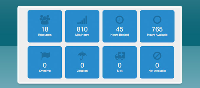
At a Glance
Our report pods always report the most up-to-date data for the date range you have chosen. This gives a producer or manager an easy to digest overview of how efficient your planning is at that moment in time.

Simple Exporting
The report table at the bottom of the page shows all the information you need for your Hub Planner. You can easily export any of this data to Excel, PDF etc to make it easy to import into your own solutions for tracking.
What’s Next for Reports?
It was important for us to release a stable first build of reports with the current feature set, which we think is pretty nice. We do have something called “Heat Maps” in development which will give a visual colorised report of how well you are booking your staff. We of course want to make sure our reports section is meeting your business needs so if you do feel you need some additional functionality then please use our feature suggestion forums to help us improve.