Best Practice to Colour Code Projects
Resource Scheduling can be quite the complex task – Hub Planner diminishes this complexity even further with an interactive colour coding option, making your resource planning process even easier!
Simplistic to use, Hub Planner added a new setting allowing you to colour code your bookings via the booking category options. Once enabled you will have a spectrum of views at your fingertips, creating new techniques to allow you to visually mark a booking with a certain status, represented by a color.
“Everything should be made as simple as possible, but not simpler.” – Albert Einstein
In the world of resource scheduling and planning there are so many different approaches to finding the right algorithm showing your project health that works for your team.
Did you know that the millenials in your team will react well to orange? Or perhaps you like to align your colours with your branding? Do you use the ever faithful but historic RAG traffic light system? Whatever style you use, your colours are seen as a status and not only is it vital you get the spectrum of shades right, it’s also very advisable to say that the definition of each shade and the language used can be just as important as the colour itself. If communicated well, in essence your resource scheduling and planning will work in an effective, efficient environment. Hub Planner have provided several parameters that you can use to determine the right resource scheduling colour categorizing that’s right for your team!
Shades & Statuses
Taking the ever popular RAG Traffic Light System being the most conventional method to monitor your progress. However, this can prove it’s problems with just 3 colours defining your entire project which is very hard to categorize all scenarios within the three lights. Not only that, you are more or less relying on the PM to categorize it within the right light. Red – shouting a warning, screaming an issue. I can hear the alarm bell sirens in my head and the stressed and embarrassed faces when red appears all over the scheduler!! Not what one wants to see, right? Amber – it’s not as harsh as red, but there are still sounds of warning that needs attention. There are risks and issues that will have an impact on the deliverance of the project. Deadlines have been missed, budget is over! And then Green – everything is hunky dory amongst all stakeholders, scope of project is on target to meet deadlines and within budget. There is an air of control and calm.
Hub Planner streamlines and segments the scheduling and planning process into a more structural realistic overview of where the team and project is by expanding and elaborating the quantity and quality of shade statuses. Giving you the opportunity to strategically select the suited colours, the quantity of statuses together with the right definitions and context behind each of the status shades.
How does Hub Planner help?
Don’t get me wrong, the RAG does work well – but how about elaborating it a little and adding some colours to view? Let’s show you an example of how Hub Planner can help you:
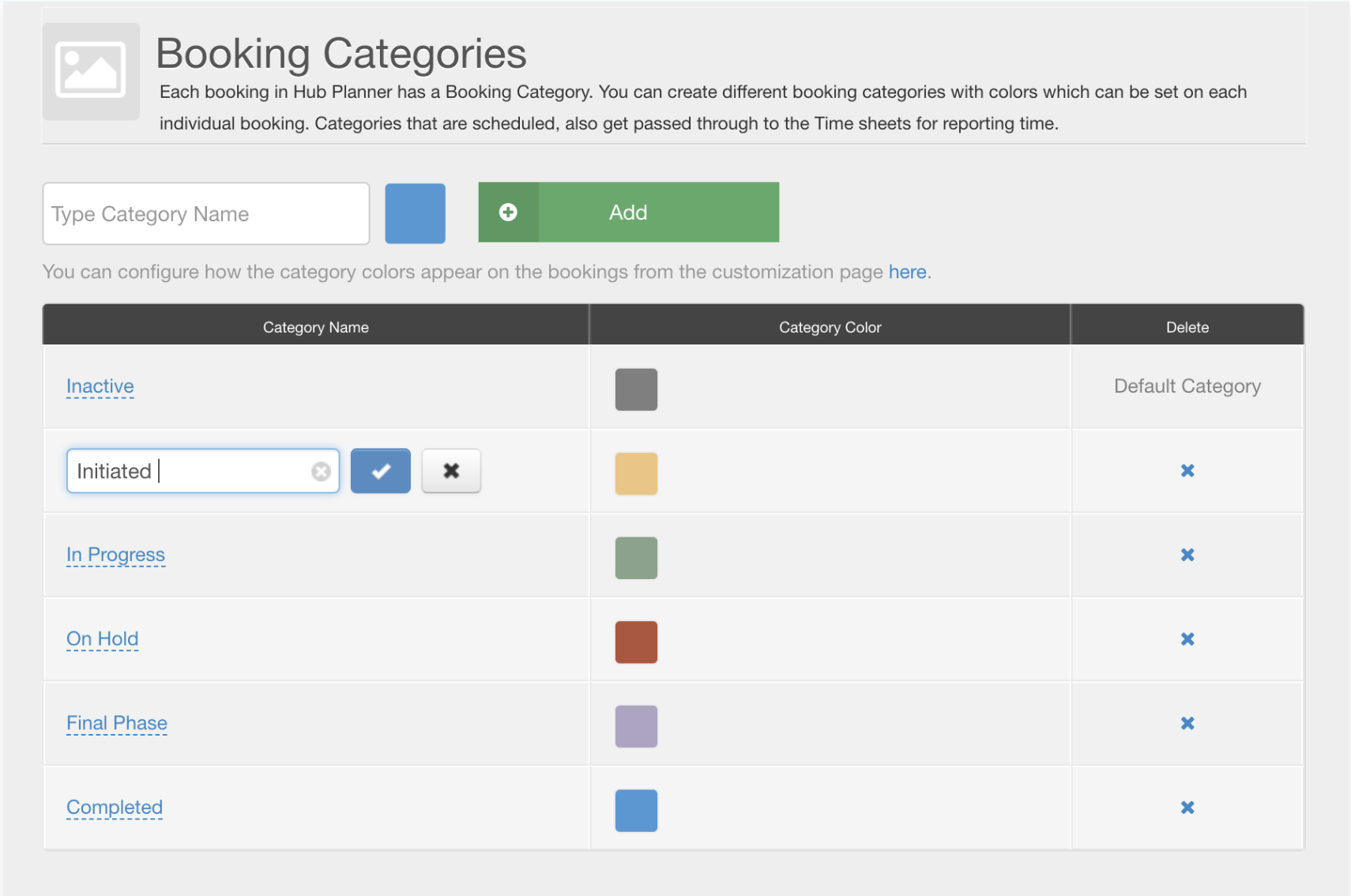
Firstly, click on Settings in the top toolbar. Subsequently, scroll on down to Account Set Up and clicking on Booking Categories. Here you will see the below screen:
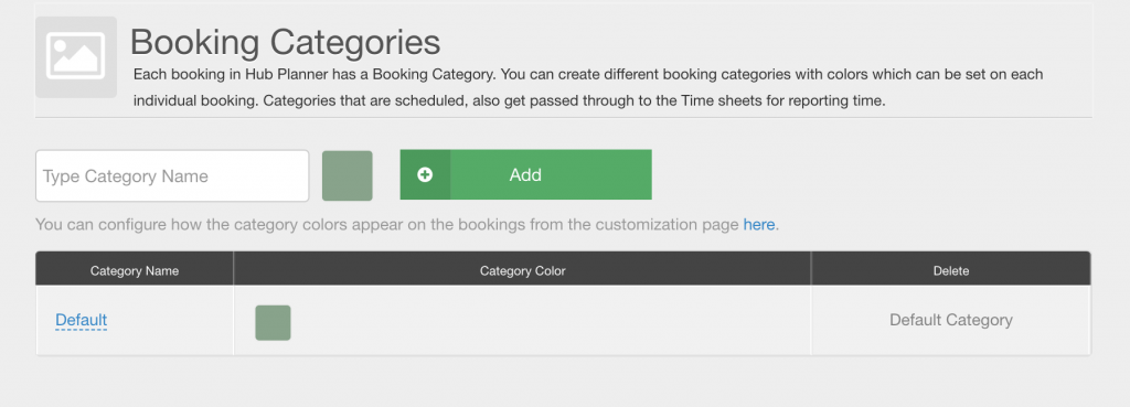
Also, as mentioned above, the language you use to define what each colour means and it’s status is vital to capture everyone singing off the same hymn sheet. I’ve opted for a scale status of what I feel would work for me.
Defaulting with the color gray and entitling it as Inactive – meaning we haven’t allocated it to anyone as of yet but we know that it’s there and we need to schedule in some resources and project time etc.
Going along the phases of a project from default inactive to completed, I’ve chosen the phase titles to represent the shade colour and stayed away from harsh in your face alarm raising colours to allow for a more shades to be added creating a thorough yet mellow look at feel.
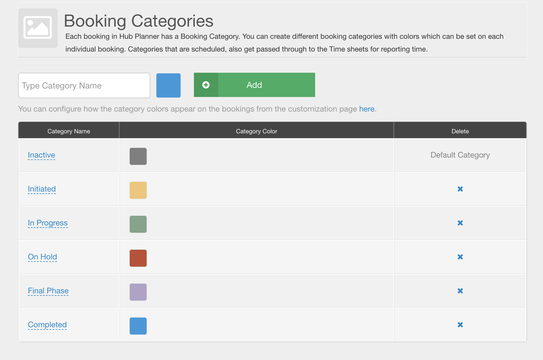
Hub Planner have made it very easy to chop and change the look at feel of the text and shades. Need to change the names of the colours and what they mean? Simply click the word as shown below and work away at renaming the colour. Remember to click the blue tick icon when you’re ready to go.
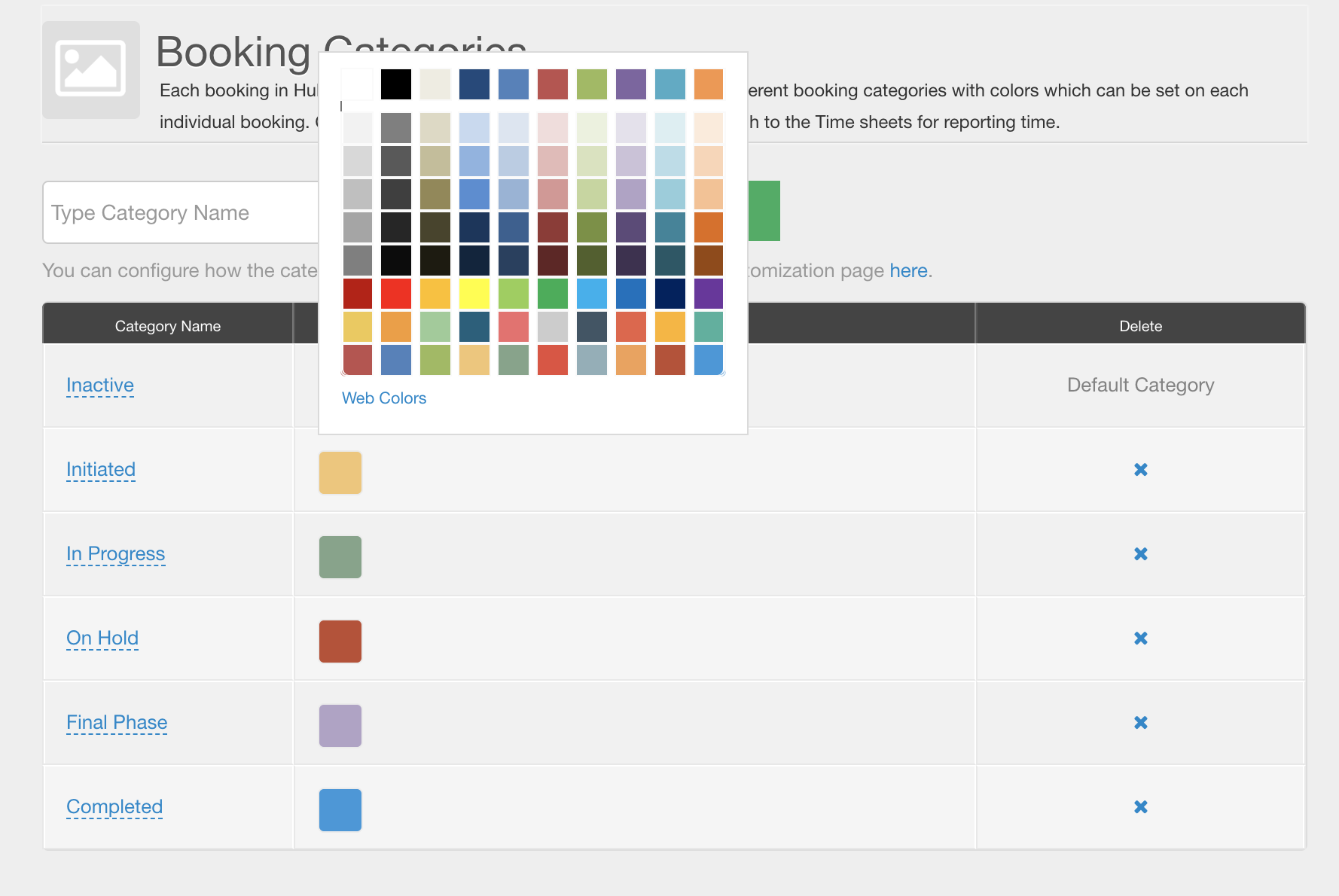
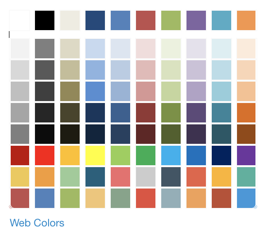
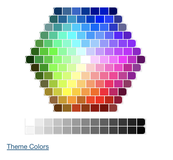
Same goes for the colour. Happy with the name/definition but not the colour? You might feel you want to expand the colours of the RAG system by adding a Yellow, Gray and Blue giving you a more definitive overview of your project. Even altering the shades of the RAG system can create a far more calm environment. Or perhaps you wish to align the colours to your brand like Hub Planner have with their default category colour shade of green? Want to use the same colour but alter the shade of to create a less harsh scary looking red? Again, just one click on the colour you wish to change – a pop up of Theme colours will appear. You can select from here or alternatively click on Web Colours and select from there.
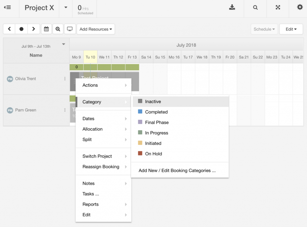
Once in the scheduler view, you can right click on the 3 dots which brings up the menu as shown below. Choose the second from the top “Category” which in turn all of your customized category colours appear. Here you can simply select your desired position of the project.
For more of our latest releases and updates check out our post on our Summer Schedule here ! Also, Hub Planner offers an impressive 60 Day Free Trial – try us out!

