Improve Resource Teams Capacity Planning with Heat Map Reports
Heat map reports are a versatile and efficient way to swiftly gain insights to data trends and patterns. But how can we use heat maps to advance and boost resource teams capacity planning? Well, the visualization of existing data values becomes enhanced with a heat map function. The report data becomes easier to distinguish. Heat map reports are innately self explanatory, simplifying the communication of key data. You will come across heat maps in many ways, not just in resource management. For example, Strava use heat maps to show global activity. Like Strava, all Hub Planner reports are in real time. What is the benefit? You can track and monitor resources, teams and projects with immediate live data. This allows you to accurately gauge capacity and utilization planning. In turn, decisions can be made more quickly and strategically bettering resource teams capacity planning.
How does Hub Planner help?
Hub Planner encompasses a number of heat map report templates that provide a visual breakdown of projects, resources, events and unassigned work. The breakdown in defaulted by each day based on the current month. Indeed, alter dates for a more in-depth focused or an expansive view of data. Each template helps to focus on important information relating to the progress of projects, budgets, resource capacity and utilization.
If you look at the key benefits we highlighted in Hub Planner’s Resource Heat Map Scheduler Functionality. We talk about how using colors to represent the varying levels of resource availability and capacity. A heat map will provide transparency as well as visually enhancing the scheduler. Thus, making it easier to identify and analyze team resource capacity planning.
The idea and advantage of the “heat map” view in your scheduler allows you to visualize and identify individual and team resource availability where you can optimize and forecast the scheduling and planning of resources. – Resource Scheduling
Heat Map Reports Folder Templates
View Heat Map Report Templates by Project, Resource, Events and Unassigned Time. Templates include Scheduled Time, Reported Time, Booking Categories, Forecasted Availability and Forecasted Utilization.
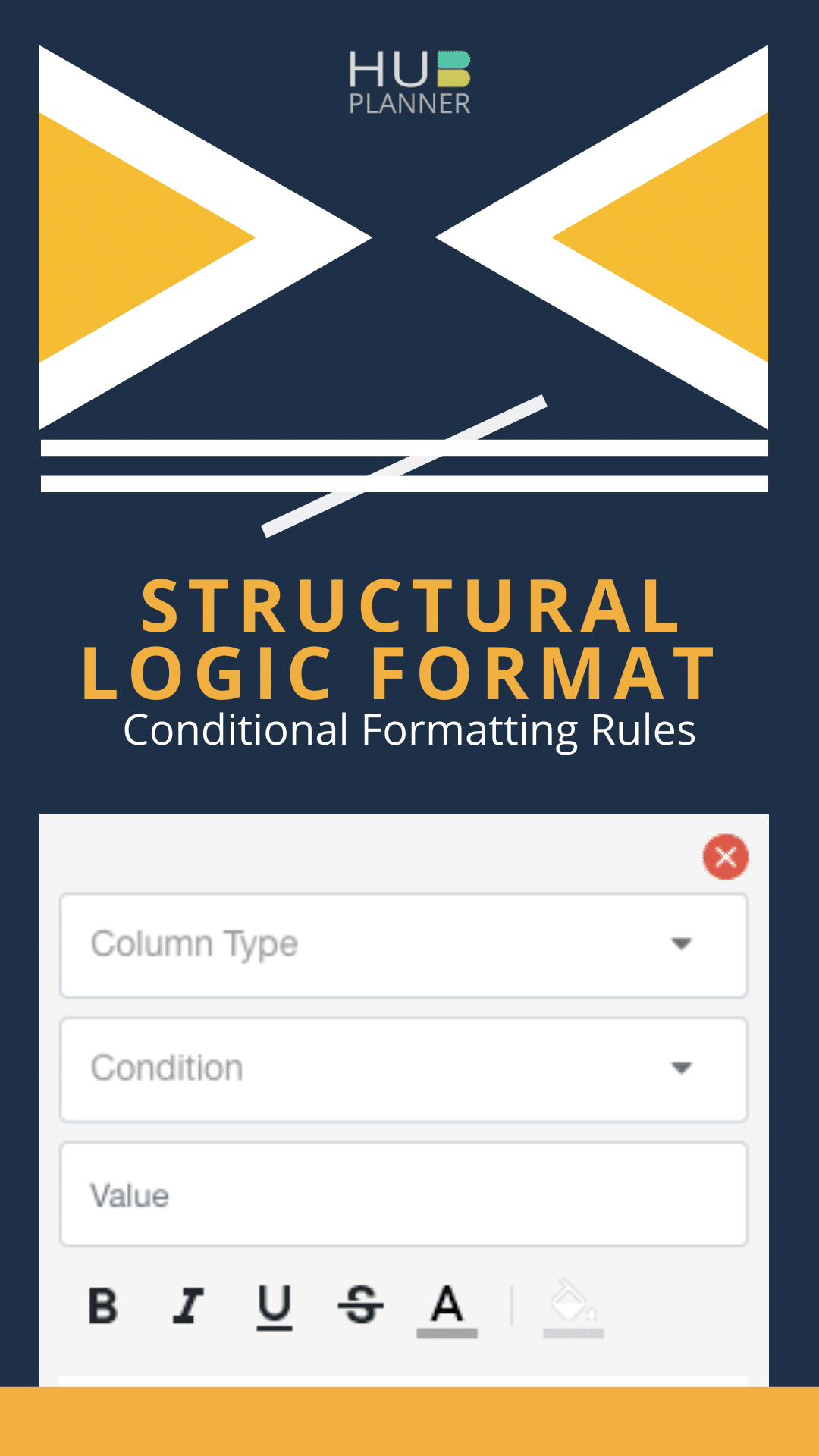
Conditional Formatting of Heat Map Reports
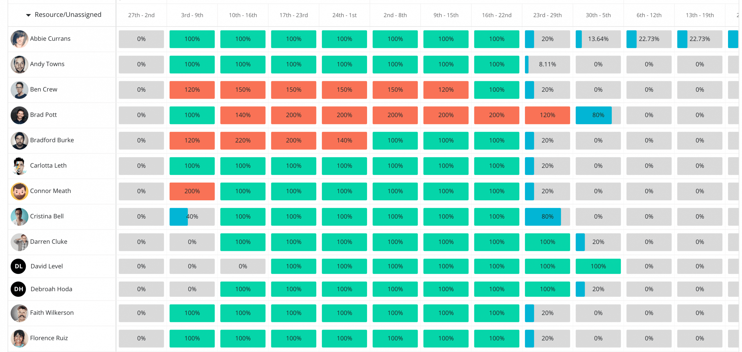
Format temperature reports by creating conditional formatting rules. Distinguish data with formatting options such as color code and font highlighting. Apply single or multiple rules to the heat map report to highlight key data. Heat or Cool check the temperature of teams resource capacity.
See example below of how the report colors changes to highlight formatted data. Sample conditions applied as follows with sample color conditions:
- Time = 0 (Grey) Timings to highlight weekend hours perhaps
- Time >= 1 (Orange) Resource needs more scheduled time
- Time > 6 (Blue) Resource is not optimized to their capacity (Cool Map)
- Time = 8 (Green) 100% capacity allocated
- Time > 9 (Red) Over scheduled
")
Heat Map Report Toolbar Options
The chart option within the report toolbar allows you to visualize data from a whole other aspect. The chart option transcribes the heat map data into a graphical chart. From cool and heat maps to charts, you have options to adjust axis and chart type to optimize chart data. For examples, change the x-axis to represent time instead of percentage. You can also change the color of the chart data. An ideal way to utilize the color pallet is to adapt to the heat and cool map view. This way you are representing data in the same way as the heat map report does. Another nice option is to match the data to your brand colors.

Save Report Templates
Should you need to save or share your report data? You have three options. Firstly, you can save your report internally with access to the Internal Reports Folder. Any colleagues how have permission can access your report from this folder. Make sure to label it with this in mind. You can also opt to share the report via a simple URL link. Lastly, you have the choice to also save the report to your own folder. Any of your saved reports will be saved within the My Saved Reports folder.

Conclusion
In conclusion. Heat map reports are a simple and effective way to keep updated with key information which helps resource management. Heat maps create a visual call to action to important dates and key data. Now make decisions more quickly and effectively. Both cool or heat temperature reports allow you to improve resource capacity planning for teams. Analyzing report data is reduced with the automation of distinguishing values by color or font. In turn, this allows you to focus on productive important decisions.