Brand New Dashboard for Hub Planner
Today, Hub Planner unveil the a brand new revamped Dashboard. One of many new updates to follow, we firstly releases the brand new Hub Planner Dashboard. Available to all new and existing users, the updated dashboard will showcase Hub Planner’s strong commitment to beautiful design and user centric functions.
The design makes it really easy to see what you’re scheduled on and when. All the relevant details you need to know are right there. Really creating a perfect home page for users to see what’s happening all in the one spot – existing Hub Planner user
The new Hub Planner Dashboard is a one stop shop for a snapshot of project and resource stats and progress. Broken down nicely into silos and pods, each with relevant and further details to represent the project or resource data. As always, the design is bondelaire, with an awareness for showing just the right amount of information the user needs. Dynamic widgets, pods and inline tabs are all new additions to the rejuvenated dashboard. Let’s take a look to see what new?
So What’s New?
Inline tabs extended each dashboard view to give you more options to move around and see contextual information. Quickly navigate between Dashboard, Projects, Resources and Schedule to view a snapshot of the content.
The Sidebar is packed with options to help you quickly navigate between the different types of dashboard options. Flip between My Dashboard, Project Dashboards and Resource Dashboards. Each Sidebar option has its own menu with unique options.
The Knowledge Base will take your through the ins and outs of the Dashboard as a whole. Here, let’s focus on what’s new to the Hub Planner Dashboard and how it can help you better your resource management and analytics.
Do I need to update my Hub Planner settings? The new Dashboard will automatically appear once you next log into Hub Planner or indeed refresh your page. It’s not like an Apple software update and you sign your life away :)
My Dashboard and what’s new?
My Dashboard is designed with the daily user in mind. What will I see? My Dashboard will give you an overall, birds-eye view of your time scheduled v reported, your schedule timeline, how well you’re being utilized, projects you’re working on and your tasks overview. All in easy to read and view charts, pods, widgets and tabs.
So what’s new with Dashboard? We’ve added new functionality, new pods and dynamic widgets with more relevant and updated information for the everyday user. Not only that new inline tabs are on view which separates data and provides easy to navigate silos of information about your stats, schedule, tasks and projects etc.
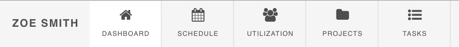
Navigate between the five inline tabs for more details on your schedule, utilization rate, projects you’re working on and tasks.
- Dashboard
- Schedule
- Utilization
- Projects
- Tasks
You’ll notice new similarities that translates throughout Hub Planner. Whether it’s from reporting columns or slack notification and how your timeline is viewed.
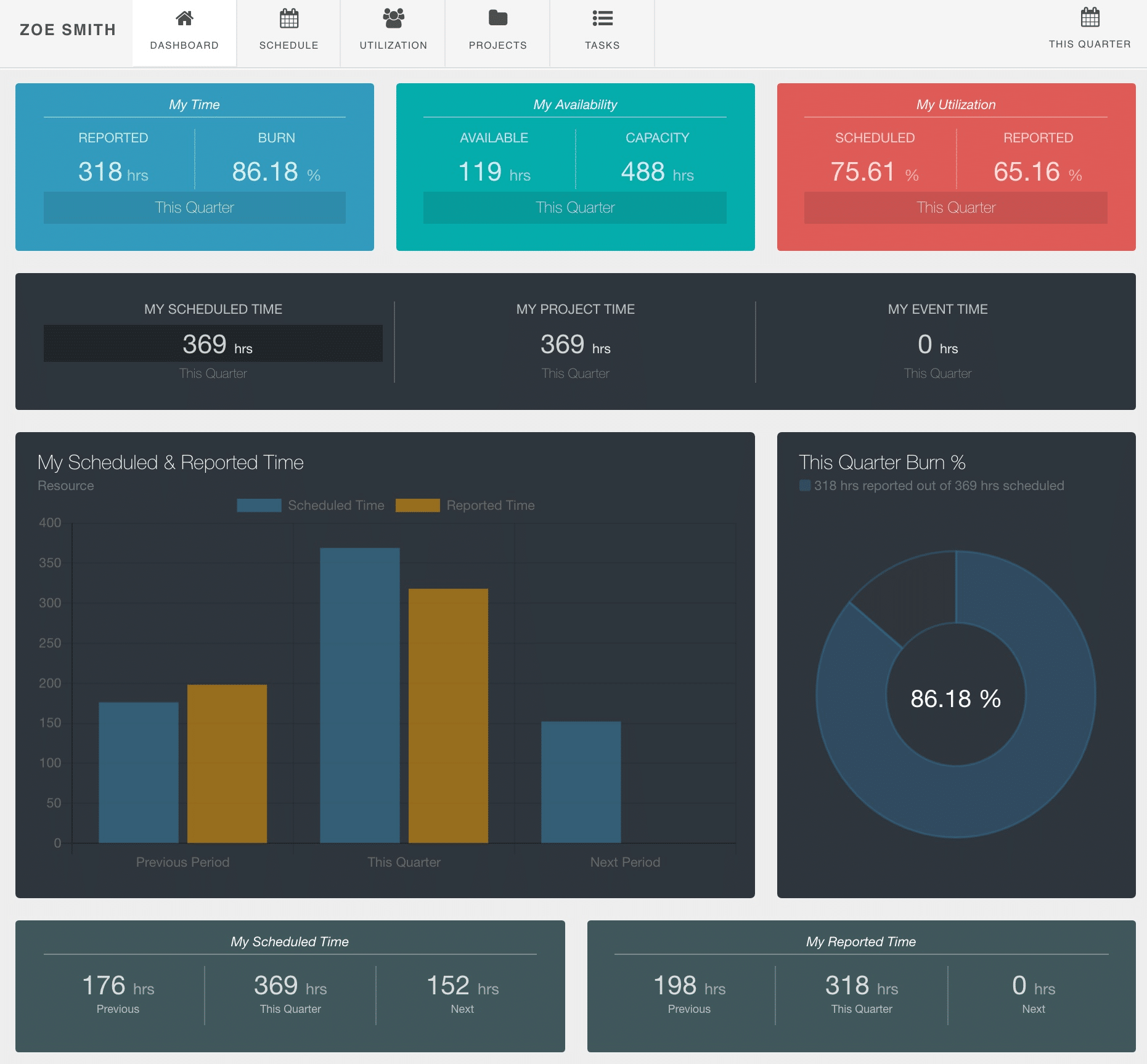
My Dashboard
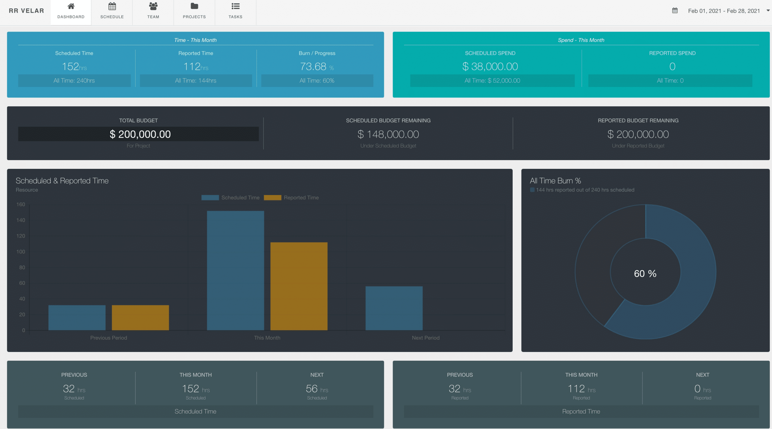
The homepage of My Dashboard. Here will display the high level data providing you with a clear and concise picture of your time. Siloed into pods and widgets, each of which breakdowns or charts the high level stats of where your time is being spent. Easy to follow and simple to use – My Dashboard is super helpful for all users of all levels to see where their week/month is at. What my schedule looks like, how much available time I have left, show me what I reported on my Timesheet and even burn rate. All, in a one shop stop style.
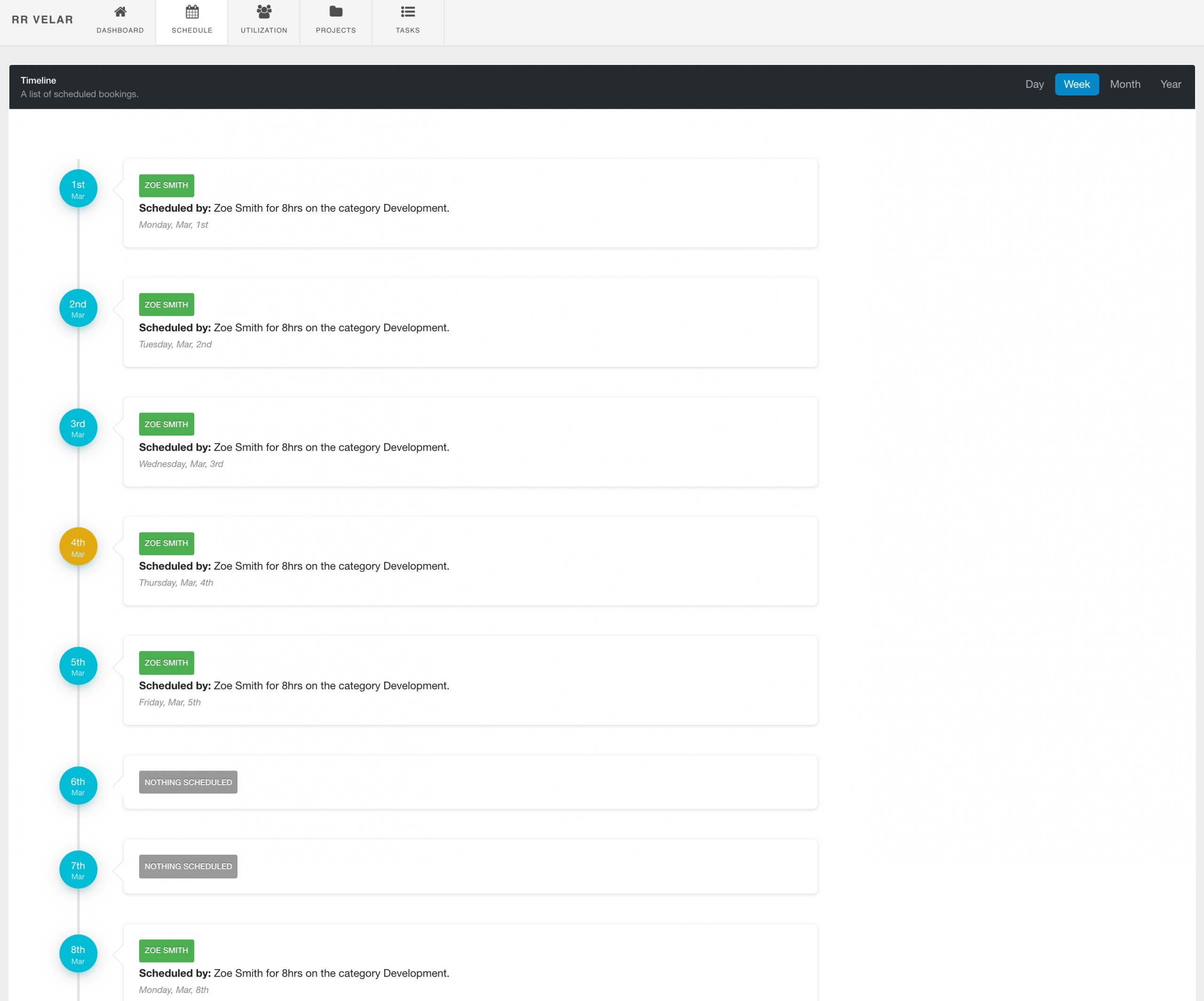
My Schedule Dashboard
Also a new update to the Hub Planner Dashboard. We got rid of the out dated, space hogging calendar. Now, a clear timeline list, similar to what you see in your Slack schedule reminder notifications. Each details the most relevant information about your schedule.
- Date
- Project Name (Green meaning Active project)
- Creator of Booking
- Allocation Time
- Booking Category
- Day / Date
- Utilization Rate
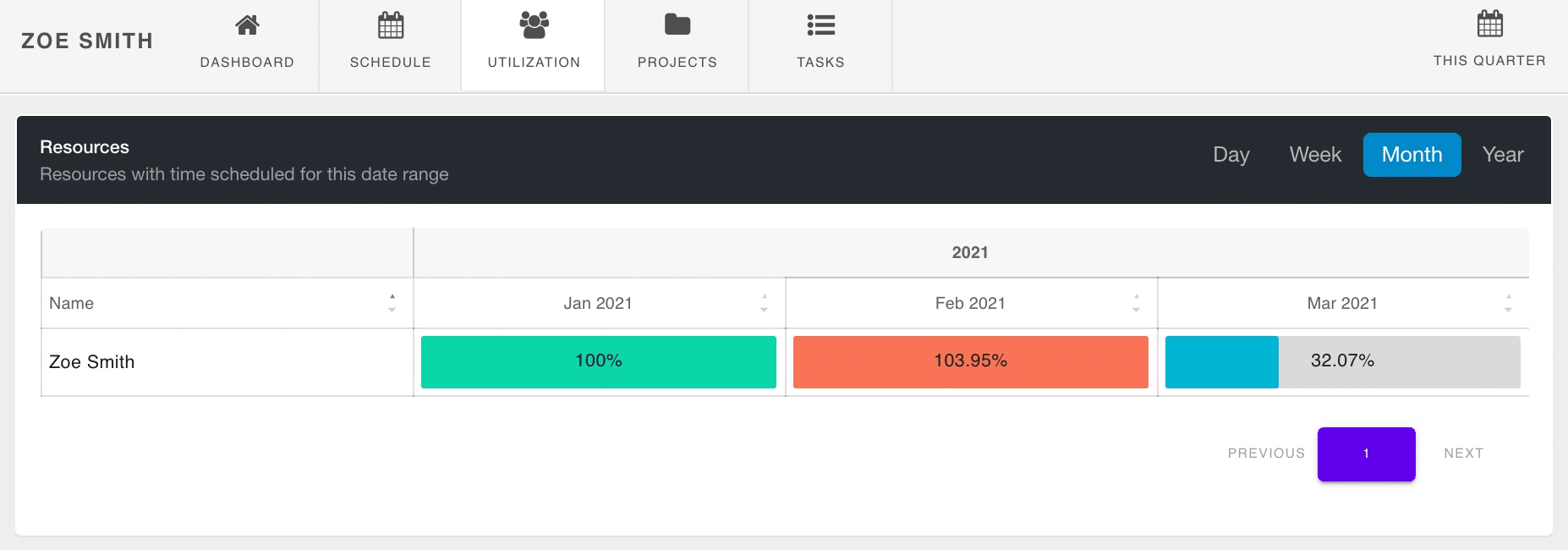
My Utilization Dashboard
Ask, and you shall receive. One of Hub Planner’s most popular reports has made it to it’s own tab in the new dashboard! Indeed, my utilization rate now appears as a heat map broken down by the frequency option you chose. Click the quick access menu for a drop down of date range options or custom pick your date range. Also choose how you want the data to show? By Day, by week, month etc.
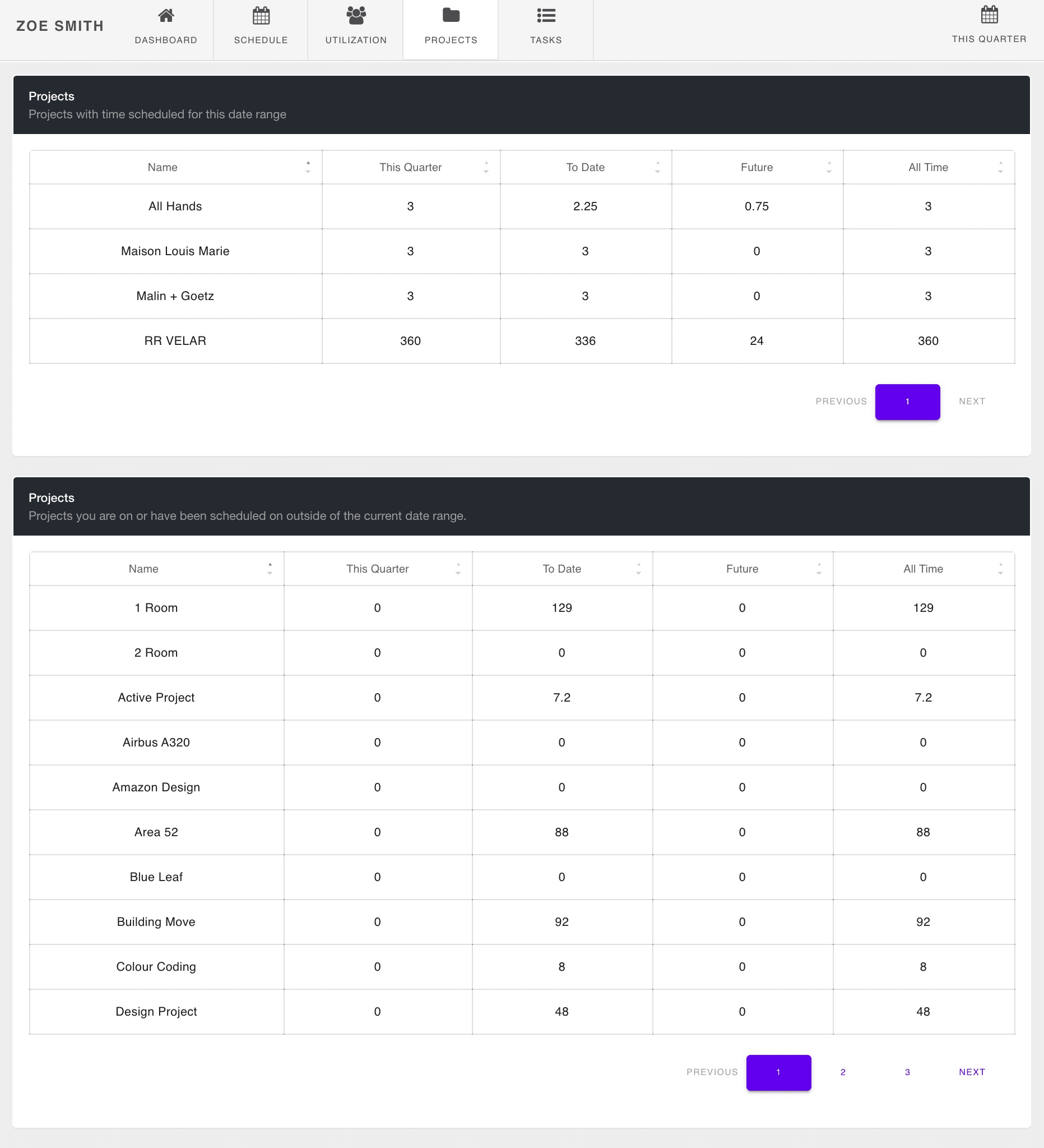
My Projects Dashboard
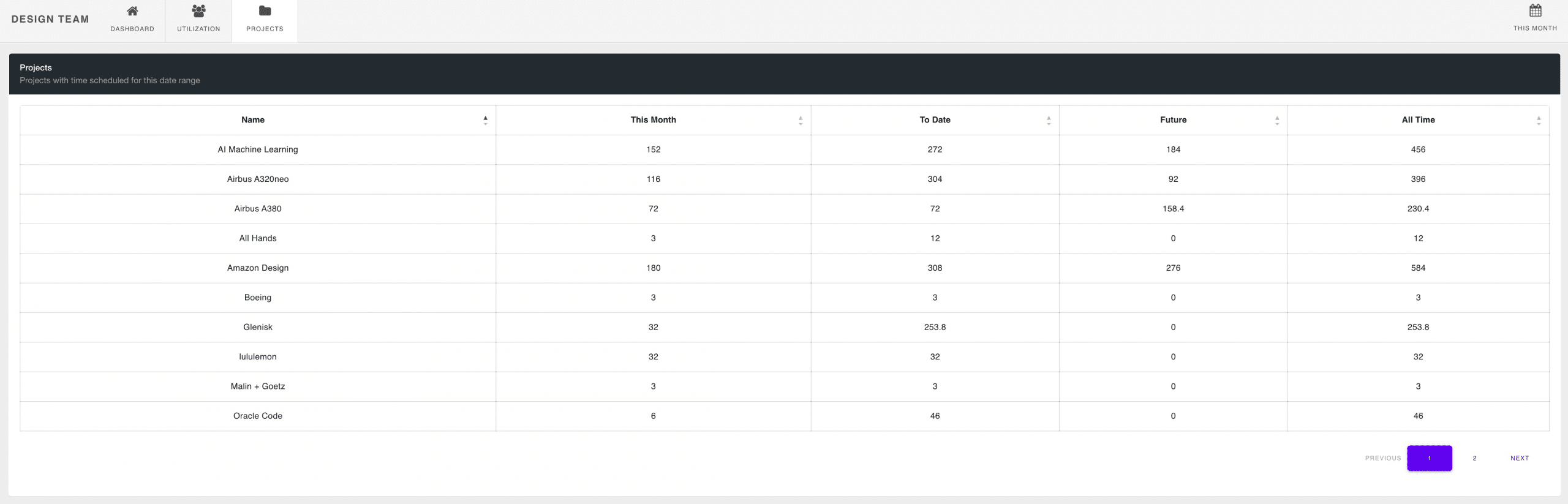
My Projects tab allows each user to see their breakdown of data for the project within the time range chosen. There are two new widgets here in My Projects. The first widget showing a breakdown of the projects your are working on within the date range chosen. The data you will see will be the name of the project, the time this period, to date, future and all time.
But, not only that, below in the next pod you have a clever widget showing all other projects you are a part of. But the difference being, you’re not scheduled on thse projects during the time period chosen. Clever right? Condensed to enhance your view, scroll through the pages for more projects you’re a part of. Use the sort function to show the data as you prefer.
Notice some similarities from Hub Planner reports? Yes, indeed. Keeping like with like and consistency throughout Hub Planner, you will notice that the time periods reflect the same as what is set in Hub Planner’s Reports. This Period, Last Period, Next Period, To Date, All Time, etc. All of these time periods are very same to what you will see in a Hub Planner report, you will also see in the Hub Planner Dashboard.
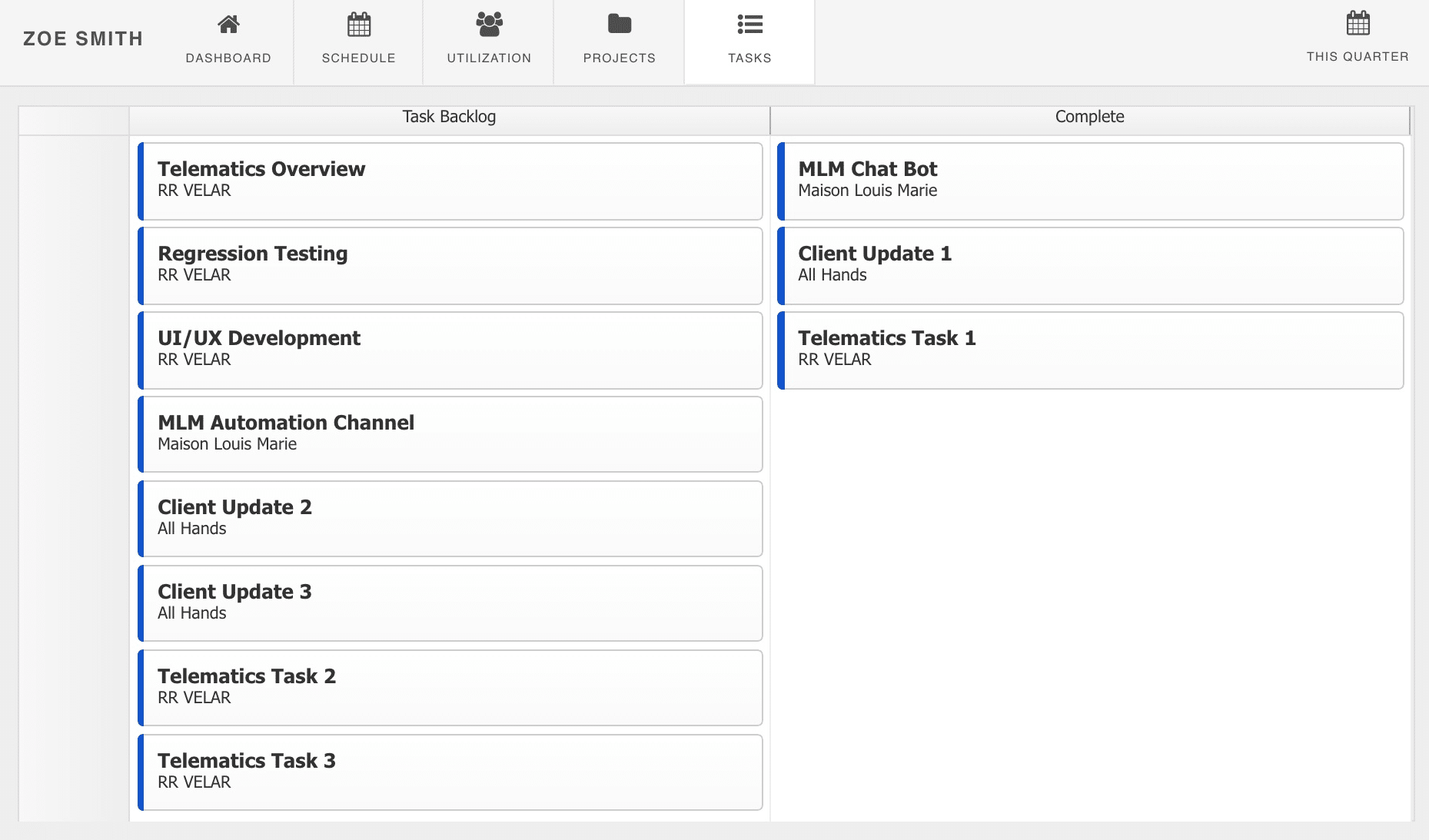
My Tasks Dashboard
Also new to the my dashboard, is the drag and drop tasks function. Within the tasks tab will show the scheduled tasks and those that are completed. Hub Planner loves to drag and drop, and my dashboard tasks are no different. So, we decided to add the option to easily update your tasks right here in my dashboard. Use the drag and drop function to move tasks to complete or to be completed. You can even delete a task here too.
Dashboard Pro
 Dashboard Pro allows you to greatly enhance the function and scope of the dashboard. More functions, and better usability for management to view the project and resources in better detail. The sidebar of Dashboard Pro populates with two extra tabs – Projects and Resources. Now view a dashboard of selected projects, resources, project groups or teams. Each following with new and improved functions for a greater, enhanced picture of performance and analytics.
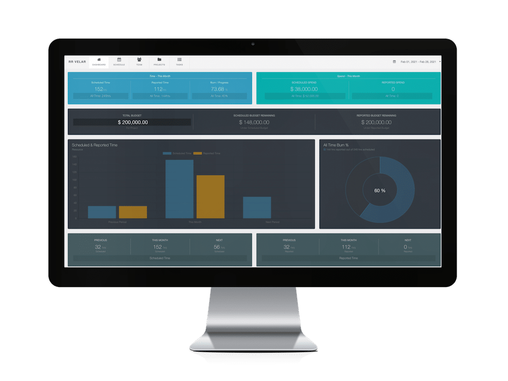
The Project Dashboard
Viewing a single project will really provide you with the need to know intricate details of the project. Each project dashboard is split into 5 tabs.
![]()
- Dashboard
- Schedule
- Utilization
- Projects
- Tasks
Project Dashboard
The homepage of the project. Providing you with an illustrative, birds eye view of all project stats including:
Time, spend, budget, scheduled v actuals and burn rate. Each in a pod of their own detailing the topic in more depth. Changes date ranges for more analytics via the date picker at the top right of the page.
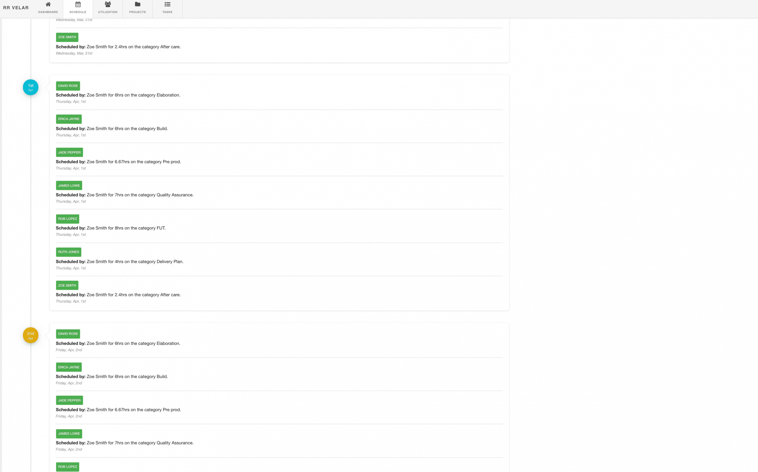
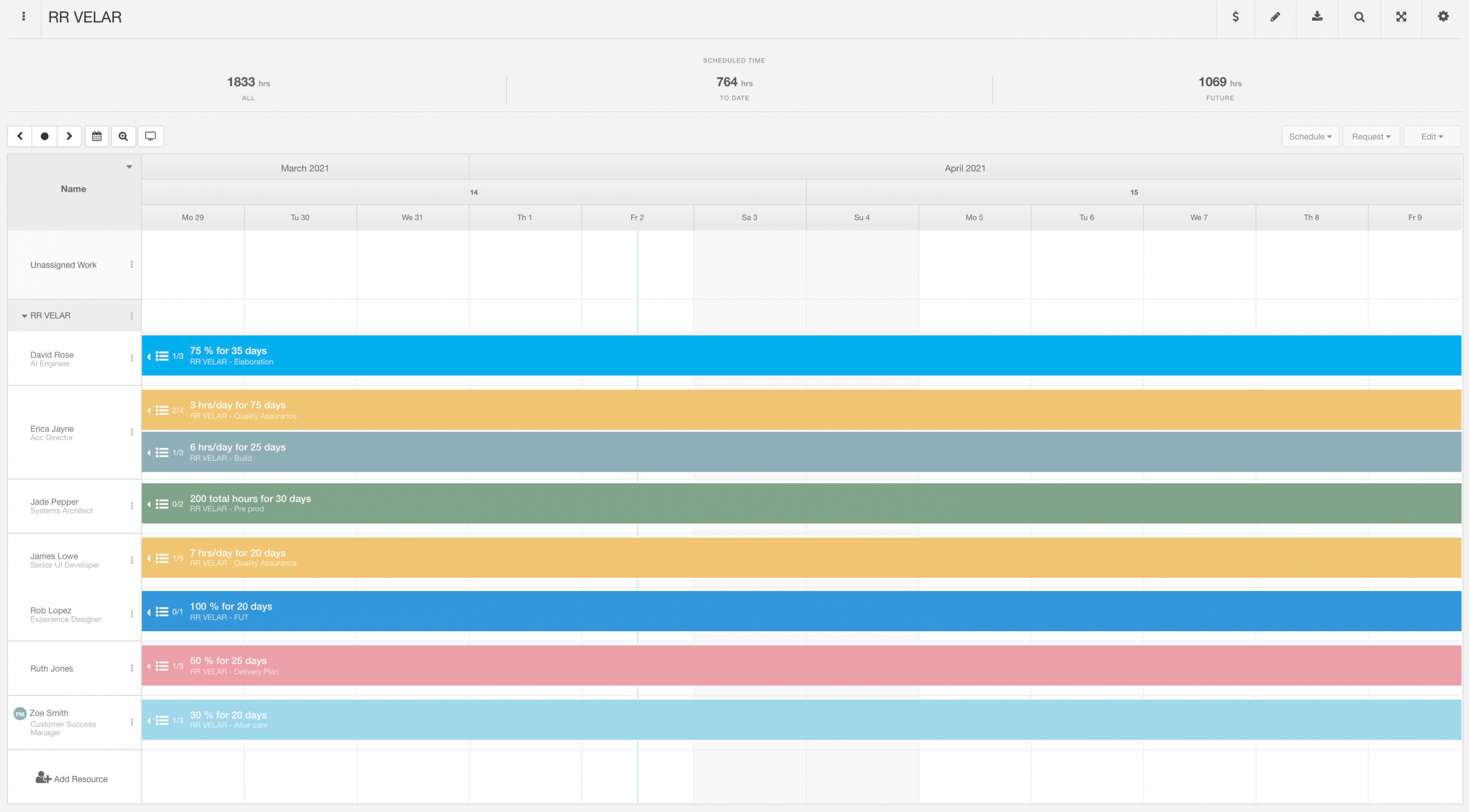
Project Schedule
The schedule layout provides you with a day by day breakdown of project resource time. Select a date range option from either:
- This Week
- This Month
- Next Week
- Next Month
Who’s working on what? What booking category has been assigned? The scheduled booking details will show:
- Resource Name
- Creator of Booking details
- Booking Category assigned
- Allocation time in hours
- Day and date.
You’ll notice the dates running concurrently along the dashboard. handy for scrolling along. The current date will be highlighted in orange, the rest in blue.
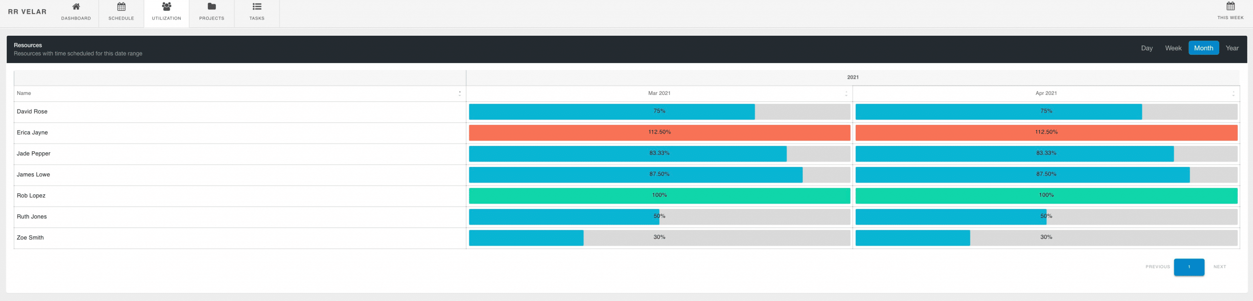
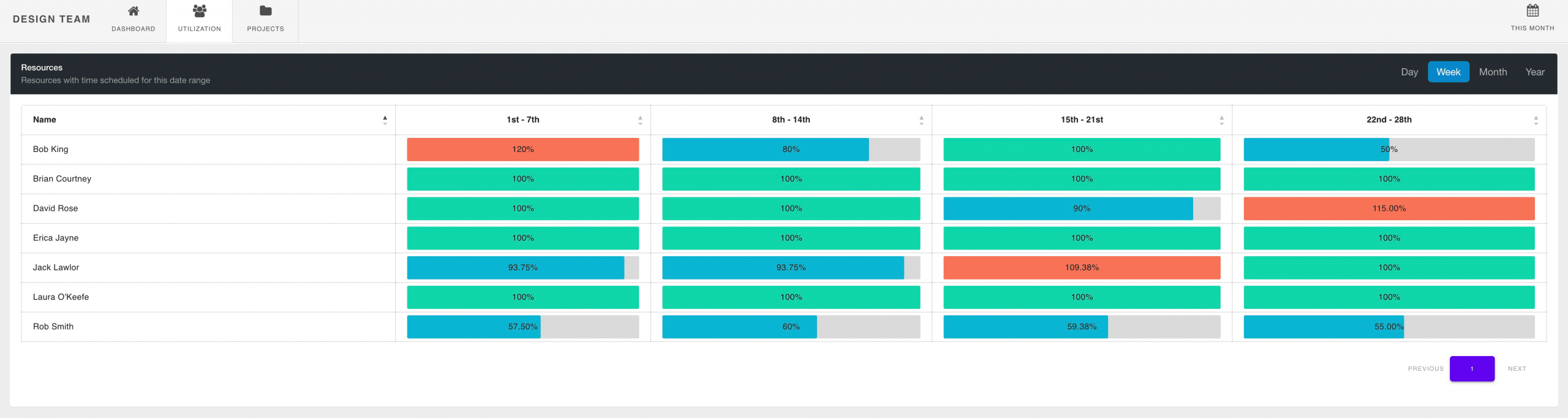
Project Team Utilization
The project utilization tab provides you with a breakdown of individual resource utilization rate for the project against the date range chosen. Pick between three different time stamps.
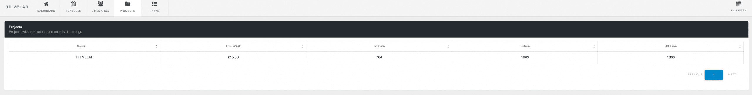
Projects
Project time against the date range chosen with added columns detailing time scheduled to date, future and all time.
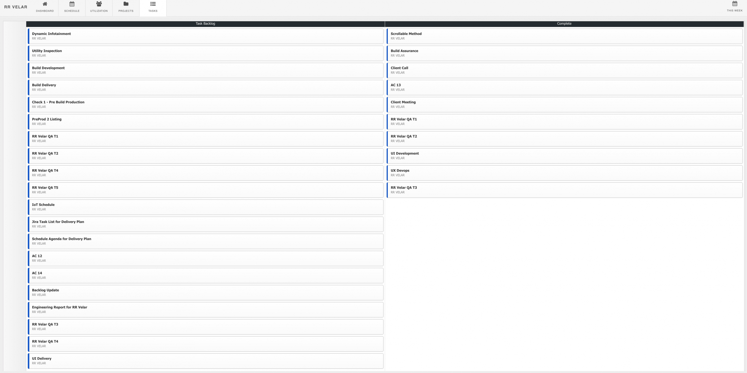
Project Tasks
View all project tasks in one spot. Not only that, Drag & Drop Tasks – another new feature to the revamped Dashboard. The ability to drag and drop tasks within the dashboard, not only changes within the dashboard, but naturally within the scheduler booking also.
You can also delete a task too!
Compare against the scheduler view:
Hub Planner Scheduler showing single Project
The Resource Dashboard
![]()
Select a Resource, or a Resource group from the sidebar. Within the Resource Group Dashboard, you will see 3 inline option tabs. Dashboard, Utilization and Projects. Should you choose to view a particular individual resource, you will get the inline options of viewing the resource in more detail with the dashboard, schedule, utilization and projects etc. Same as what you would see in My Dashboard, but of a selected resource.
Easily view a snapshot of how well your team are performing with the resource group dashboard. Widget and charts display realtime stats of everything resource time. Move to the next tab to display the utilization rates broken down by team members and view project performing stats for the team in the project tab.
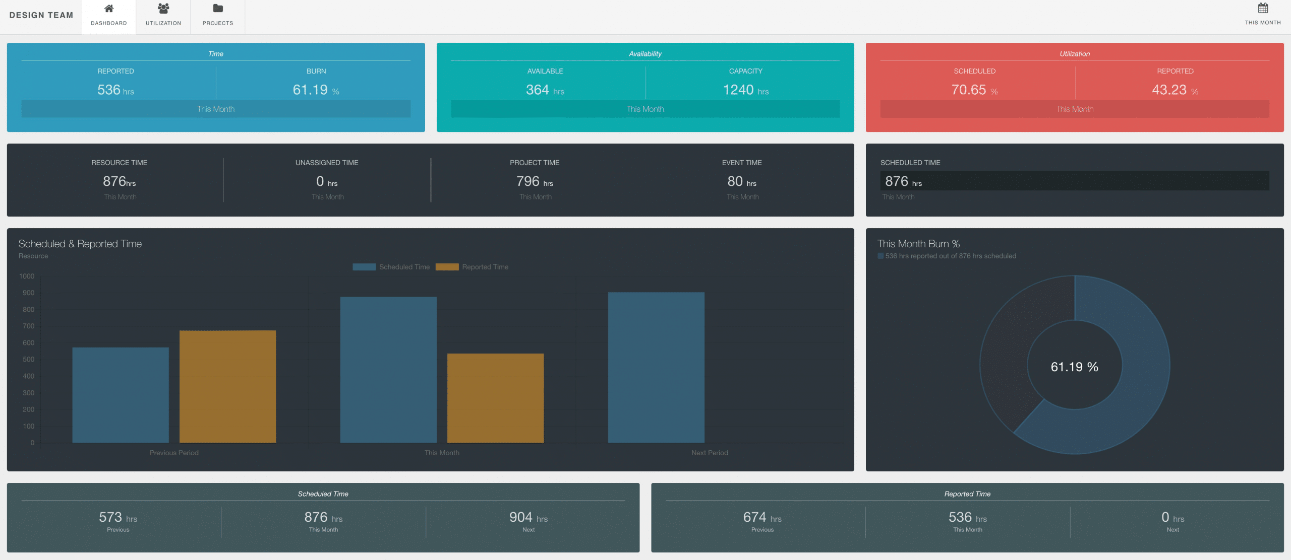
Resource Group/Individual Dashboard
What will we see in the Resource Group Dashboard?
Firstly, date wise, the dashboard will default to show data within the current month. You can opt to adjust the date range from the date picker in the top right hand corner of the screen for a custom date range. All data is real time, once adjusted.
Next we will look at the first row of widgets and what the data shows and means.

- Time – Reported Hours + Burn Rate
- Availability – Availability in Hours + Capacity in Hours
- Utilization – Scheduled % + Reported %

- Resource Time – Total hours scheduled on Resources for the date range selected.
- Unassigned Time – Total hours scheduled on Unassigned Work for the date range selected.
- Event Time – Total hours scheduled on Events for the date range selected.
- Project Time – Total hours scheduled on Projects for the date range selected.
- Total Scheduled Time – Total hours combining all scheduled time across Resources, Unassigned Work, Event and Project time.
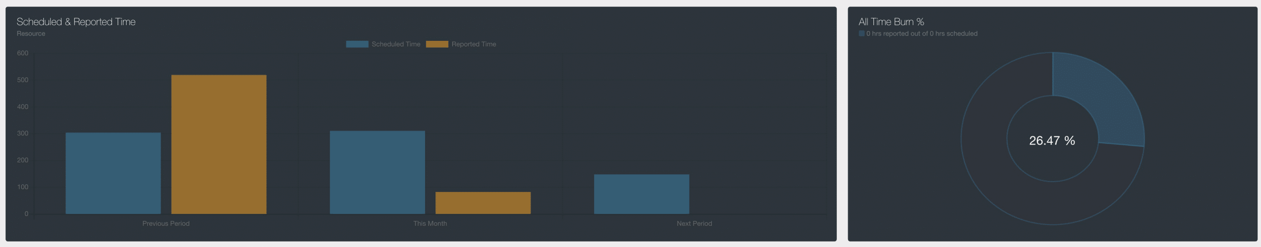
A bar chart showing Scheduled and Reported time over 3 date ranges. Previous, Current and Next date range is shown here. Two columns appear for each date range, scheduled time and reported time.
The right had circular pie chart will also show the burn rate. The burn rate indicate the scheduled v reported time for All Time.
Lastly, we will look at scheduled and reported time in more detail between the 3 different date ranges.

Resource Team Tab
Will show a quick snap shot of your utilization rate which means from your capacity, as a percentage, how much time are you scheduled? You will also see your scheduled time in hours for the date range selected, the previous period and the next one.
Resource Projects Tab
Click the Projects tab to view a list of projects you’re scheduled on within the date range selected. Not only a list of projects, but the scheduled time data detailed out to tell you how much time you are scheduled on each project and breaking it down by different columns:
- Date Range Selected
- To Date
- Future
- All Time
Resource Group/Individual Project Breakdown
Individual Resource Schedule Tab
The new Resource Schedule gives you a day by day breakdown of your schedule for the week or month. Choose between:
- This Week
- This Month
- Last Month
- Next Month
The breakdown of your resource schedule will document the following details making it easy and straightforward to see where you’re at. Of course, any changes to the schedule are updated in your dashboard schedule in real time.
The design makes it really easy to see what you’re scheduled on and when. All the relevant details you need to know are right there. Really creating a perfect home page for users to see what’s happening all in the one spot.
Resource Tasks Tab
Tasks are popular with project and resource bookings. Here is a list of all your tasks within the dashboard. Handy right? You will see the backlog of outstanding tasks and also a column showing completed tasks.
How to install the new Hub Planner My Dashboard and Dashboard Pro?
The new features of the new Hub Planner dashboard will automatically update for all users. There is nothing you need to do. If you don’t have the Dashboard or indeed Dashboard Pro installed you can simply navigate to your settings to install. This article will help you with installing any Hub Planner extension.
Need to know more about the new Hub Planner Dashboard and Dashboard Pro?
Absolutely, Hub Planner’s Knowledge Base is full of helpful articles and reference guides for our users. Here’s the link to the New Hub Planner Dashboard section of the Knowledge Base.