Timesheets Design & UX Update
Today we have released an update to the design and usability of our Timesheets Extension. Towards the end of 2016 we asked you for suggestions on the current version of Timesheets, in an effort to take those suggestions on board and make a big impact for Hub Planner Timesheets v3.
The response was amazing, full of constructive and positive comments pushing us to make the experience even better, as well as stories of how the current version works well for a lot of businesses. We chose a number of customers to speak to directly, and as a team we sat down and went over every last suggestion together. A lot of great ideas came out of those sessions, but it also highlighted the need for a few immediate updates with the Timesheets that we felt we could execute before the new version is released.
Therefore we decided to make an intermittent release which mainly focuses on the design and usability of the current version without introducing new features or removing any.
We mainly we focused on 4 points.
- Usability – Less Clicking
- Usability – Time Format (hh:mm)
- Design – Visual Design Update
- Performance
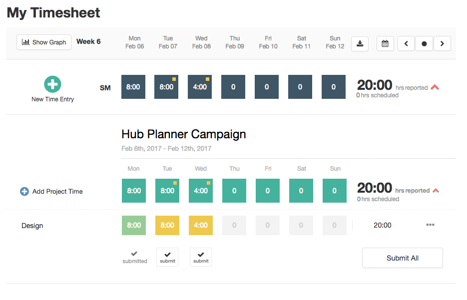
Less Clicking
The last version of Timesheets was built with an expand / collapse accordion approach to maximise the screen real estate. That approach seemed to work well, but as more customers began to create time on multiple projects in a week it became cumbersome to open and close projects. Therefore we have completely removed the requirement to click a resource or project to open them. Everything is open and you do not need to click as much to get the job done!
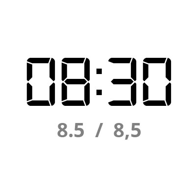
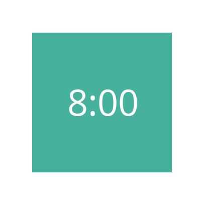
Time Format – hh:mm
Up until now Timesheets has relied on decimal numbers and not time based formatting. Now you can input time in either of the formats and it will output hours and minutes to make time creation simpler and more relevant. I.e. 4.5 = 4:30. You can decide which format you want to insert in the input field and we will always translate it to hh:mm.
Visual Changes
Major changes have been made in the visual UI, aiming to enhance the user’s overview and improve the usability overall. As a result, the timesheets look cleaner and sharper. In the new release, we removed some graphics and rounded shapes in order to create a more structured and cleaner appearance. This way it is much easier to understand what you are looking at and what resource or project hierarchy you are in. Additionally, we created fixed headers, which allows users to always see their reported time scope, as well as new popup modals for adding projects which will allow you to add projects/events even from previous weeks. Some actions buttons have been subtly renamed and made more concise, but don’t worry, the interface stayed pretty much the same.
Better and Faster Performance
Our Timesheets users can now benefit from a fresher design and a cleaner overview. The fresh breeze of changes will also speed your work up as it will reduce the amount of clicks and steps when going through your timesheets. We also bypassed the Project modal view so you can quick add time for resources as you are already in the project.
As well as that our technical team has re-engineered the engine that powers the timesheets to make it faster and more responsive.
What’s Next?
A new edition of Hub Planner Time Reporting is already under development. The new version will include new features and views to make timesheets even easier to use. When the new version will be available you will have the choice to switch to it, or stick with this version. So nothing goes away.
We hope you enjoy these updates, as a Saas business serving global customers we are listening, and working hard to make your experience seamless on Hub Planner.
If you have any questions about new updates? Contact Us and will be happy to help you.
Best, Team Hub
Oh and we also added smart filters to the Scheduler, check them out here..