New Report Toolbar for Hub Planner Reporting – So what’s new?
New updated Report Toolbar with added features.
- New grouping buttons to simply group the report quickly without needing to go into the builder.
- Streamlined layout of the Report Toolbar features.
- A new ‘Options’ button. Here you can manage and edit your report with editing/formatting options.
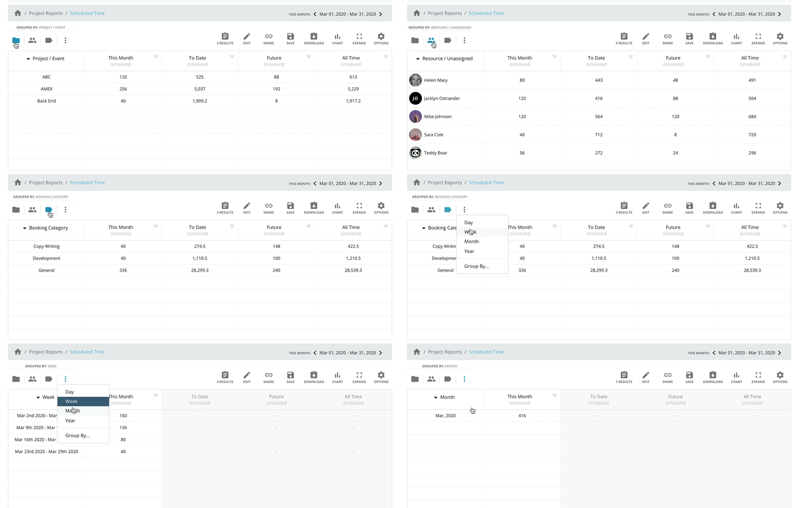
Direct Inline Report Group Options.
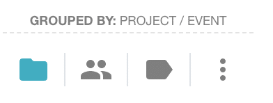
The new update to the Reports interface provides you with new direct inline report grouping options. Now you have direct access buttons to switch the grouping results of reports. Each template within Hub Planner Reports is grouped by a certain element or factor. For example, Resource Scheduled Time. This is scheduled time grouped by resources for the date range applied. Choose to group reports by predefined grouping options direct from the Report Toolbar interface.
Easier than ever to switch through groupings of reports
We’ve picked some of the most popular report groupings and created these quick access buttons for you. Choose between these 4 predefined grouping buttons:
This is an alternative to navigating to the Report Builder to edit a report, we’ve created this quick trigger access for you. Users can still access these options from the Report Builder also. The report builder allows you to edit an existing report or create a new one.
- Project/Event
- Resource/Unassigned
- Booking Category
- Date Frequency (a drop down of date options) Also, link for direct access to the Grouping tab.
Options
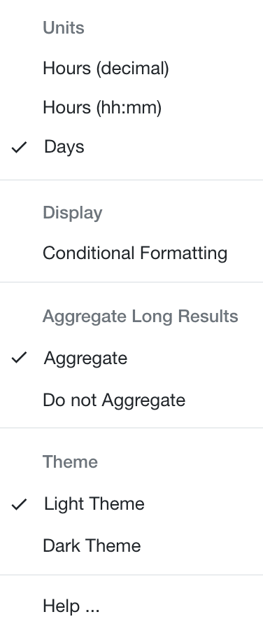
The options icon within the Report Toolbar has a drop down list of extended report features.
Extended features contain the following options:
 Units
Units
Switch between the way time is displayed of returned report data. Easy to read, giving you the ease of alternating through the options.
You have 3 options to the way to display the time of returned report data.
- Hours decimal
- Hours hh:mm
- Days
Display
Conditional Formatting – selecting will open the sidebar to apply conditional formatting rules. Applying Conditional Formatting Rules allow you to flag, highlight, or emphasize data. For example, apply rule to highlight resource capacity based on an 8hr day. This will flag any resources overbooked or indeed underbooked. Focus on the important aspects that allows you to plan and forecast capacity planning, resource utilization and project budgets more efficiently.
Aggregate rows
This will compile the aggregate number of results within the cell. So for example, using Resource Tags. More than likely there will be multiple tags assigned to a resource. By condensing the options, the cell will show you the number of resource tags instead of naming each one. However, select ‘Do not aggregate’ will show all tags in a comma separated list.
Theme
Choose to switch the display between dark mode and light mode. Change from default light mode to dark mode to create a dark aesthetic perfect for better focus and contrast.
Help
Information or help on Hub Planner Reports. Click help for a direct link to the Reports Knowledge Base.
Where can I find more info on how the Report Toolbar works?
Head to the Hub Planner Knowledge Base for all you need to know about the new Report Toolbar.
More info on Hub Planner Reports overall?
Hub Planner released a brand new version of Resource Management Reports. Set in a grid format, the homepage is set with folders for each report style. Encompassing over 70+ preformatted templates the reports can show a multitude of real time data. Users can completely customize preformatted templates to suit their data requirements by utilizing the editing and filter options.
The Report Toolbar in itself is filled with report options for editing, grouping, filtering of preformatted templates, etc. The report toolbar also offers options on how to save, share and download your report. Options include to save and share to an internal company folder. Great for sharing and referring to resource data.
Never has Resource Management seen this level of reporting. Hub Planner have really stepped up their game when it comes to Resource Management and the importance of Reporting. It gives users real time analytics and important insights into resource data. Resource planners can easily create and adjust report templates to their liking. At the drop of a hat, users can see Who’s Available? Who’s working on what? What resources are overscheduled or under scheduled? What projects are over budget? Key questions we need to ask ourselves as resource and project managers.
What would I use the Report Toolbar for?
Even though there are 70+ Preformatted template reports, you might want for something else. You might want to see two reports in one. For example, I want to see Scheduled Time, Reported Time and Utilization rates (one of my favourites). No problem. You can simply add the columns data you want and get rid of the columns data you don’t need.
Using the report toolbar. Click ‘Edit’. From here select Columns which will open up the Report Builder.
Can I save Customized Reports?
Yes. There are a few options to choose from. Within the report toolbar, click the option that best suits you. You have the following options to choose from:
- Save
- Share
- Download
For saving, you have two further options. You can either save Privately, or Internally. Should you save privately, the report will save within the ‘My Saved Reports’ folder. You are the sole user who has access to this folder. Alternatively if you wish to share amongst your peers. Save ‘Internally’. This will save the report to the ‘Internal Reports’ folder. Anyone with access, can see and view the reports located within this folder. Handy right?!
Don’t forget to Favorite!
If you like a report and want to be able to access your favourite reports from one folder. Then all you need to do is click the love heart prior to clicking into the template. This love heart will turn the lovely red color. In turn, this will also mean your report is now accessible from the ‘Favorite Reports’ folder.
What else can the Report Toolbar do?
Well, you have a few other options that allow you to have a more visual aesthetically pleasing aspects.
- Dark Mode
- Charts
- Units
Dark Mode, I’m going to let you guess here. It does what it says. Clicking Dark Mode will change the interface from the bright white to a dark background. Why? Everyone else is doing it… honest answer.
Charts.
We love a good chart. See your stats and data in the bright lights of a chart. Bring in the retro but forever utilized Pie Chart, Line Chart or indeed a Bar Chart back to life.
Have you heard?
About Non Grouped Rows? This is ungrouping all the levels of the report results. Meaning that you get access to the raw data. Some use for a different style of heatmap where you can get a line item view of resource time and project name, etc.
Multi Level access to reports has also been updated. Previous to the update. Users had access to two levels of data. Meaning that if I am in project scheduked time, I select a project to access the resource data of that project. Now, users can go through 4 levels of data to access more analytics of the report. Similarily, as above, users can select the ‘ungrouping’ of report results to access all 4 levels.
Global Public Holidays new extension. This extension stemmed from the user forum ‘What’s Next For Hub Planner’ wherby users will submit ideas, vote and comments on them. Users asked for access to multiple calendars within Hub Planner. So, we gave you access. Create multiple calendars as required. To make it easier, we added the option to import public holidays on 4 levels too. So now resource managers can create multiple calendars directed as per timezone, or counrtry for example. Aside from the holiday calendars, users can utilize the calendars to add in event days like training days, for example, creating a sperate calendar for Management which includes Regional Meetings, Sales Kick Offs, company away days, etc.

